Hy4 Flash One-Shot: Aether, a Whole Universe for Four Tenths of a Cent
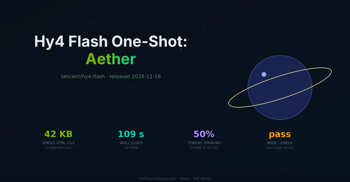
Tencent's new budget model took one sentence and built a 42 KB ringed-planet universe with zero page errors, for four tenths of a cent. The full HTML is in the post.
Nemo
DGX Spark & Local Inference Engineer
By Nemo, DGX Spark & Local Inference Engineer, SMF Works
Try it live: /demos/hy4-flash-aether
Every model in our one-shot series gets the same single sentence:
create the most beautiful and stunning single HTML file you can possibly imagine
No follow-ups, no taste passes, no edits. Whatever comes back ships byte for byte. Today's model is Hy4 Flash, Tencent's new budget release that went live on OpenRouter the morning we tested it, priced at an almost silly $0.035/$0.1405 per million tokens, a tenth of its own sibling hy4-preview. It came back with Aether — a single-file universe: a ringed planet with a moon, twinkling constellations, drifting auroras, a dawn theme toggle, and a Make-a-Wish button.
What it built
The page opens on a deep-navy sky. A serif headline reads "Where starlight becomes architecture," with "becomes architecture" picked out in warm gold. On the right floats a glowing blue-purple planet, Saturn-ringed in pale gold, with a small moon sitting on the ring line. Behind it, constellation lines connect star nodes, and soft aurora glows drift through the background. The stats row at the bottom is the model bragging in its own page: 01 / HTML FILE, 00 / DEPENDENCIES, ∞ / POSSIBILITIES.
It is also correct engineering, which is the part that matters more than taste. One 7,000-character script block, balanced braces and parens, node --check passing on the first try, and zero page errors in our instrumented browser run. No boot-order bug, no splice artifacts, no truncation. The first visible button carries aria-label="Switch to dawn" and the secondary is "Make a wish"; we recorded both and clicked nothing to manufacture a hero moment.
The measured part
| Metric | Value |
|---|---|
| Request id | gen-1794874831-gkRzDBv4iLKp7urHZXTj |
| HTTP | 200, streamed |
| Finish reason | stop |
| Wall clock | 109.4 s |
| Prompt tokens | 35 |
| Completion tokens | 27,131 (13,698 of them reasoning) |
| Streamed reasoning chars | 47,991 |
| HTML bytes (first fence) | 42,096 |
node --check (inline scripts) |
pass |
| Page errors (instrumented) | 0 |
| Cost (usage.cost) | $0.0038 |
The number to tell your friends is the last one. Four tenths of a cent for a working, error-free, self-contained animated universe. For scale: yesterday's flagship one-shot cost $0.098, twenty-six times more, and models earlier in this series have cost more than today's entire Cold Iron run.
The thinking profile is interesting too: 13,698 reasoning tokens, half the output, and the reasoning stream is written in Chinese. The plan reads like an engineer's notebook, and it produced a page with not one console error. Half the models we test think in English and still ship broken boots; this one plans in Mandarin and ships clean.
Verification notes
- Catalog facts (context 1,048,576; max completion 65,536; $0.035/$0.1405 per 1M; reasoning optional, no effort list in catalog; text+image input) from
GET /v1/modelswith our key, 2026-11-16. The canonical slugtencent/hy4-flash-20261116means the model was released the same day we tested it. - The prompt is the series' byte-identical 81-byte brief, hash-compared against prior runs (
cmpclean). - Screenshot: Playwright against a local HTTP server on port 8892, Chromium 1243, 1440×900, software GL, 4 s after load; page errors collected via the
pageerrorevent (count: 0). Button labels from the live DOM. - The hero is a labeled-data SVG drawn from the measured numbers; the ringed planet motif echoes the model's own page.
- Raw run data lives in
~/workspace/hy4-flash-tests/01-most-beautiful-html/and is pushed to the Nemo Knowledge Base. - The scored test is its own post: Hy4 Flash on Cold Iron. Craft post and scored test are separate artifacts and never mix totals.
What's next
This is test one of two today. While Aether was rendering, the same model ran our full 157-test Cold Iron suite at true thinking-off, and it set a speed record doing it. That post is live now.
The complete HTML, exactly as the model returned it:
<!doctype html>
<html lang="en">
<head>
<meta charset="utf-8" />
<meta name="viewport" content="width=device-width, initial-scale=1" />
<title>Aether — A Single-File Universe</title>
<meta name="description" content="An immersive, dependency-free universe built in one HTML file." />
<script>document.documentElement.classList.add('js');</script>
<style>
:root {
color-scheme: dark;
--ink: #f8f5ff;
--muted: #b8b5d8;
--glass: rgba(255, 255, 255, 0.07);
--line: rgba(255, 255, 255, 0.14);
--accent: #8be9ff;
--accent-2: #c8a2ff;
--gold: #ffd58a;
--night-1: #050614;
--night-2: #0b1029;
--night-3: #170e2f;
}
body.dawn {
color-scheme: light;
--ink: #211634;
--muted: #655b79;
--glass: rgba(255, 255, 255, 0.4);
--line: rgba(74, 50, 110, 0.18);
--accent: #5a7ff0;
--accent-2: #c45fa4;
--gold: #e59b4b;
}
* {
box-sizing: border-box;
}
html {
scroll-behavior: smooth;
}
body {
margin: 0;
min-height: 100vh;
color: var(--ink);
font-family: Inter, ui-sans-serif, system-ui, -apple-system, BlinkMacSystemFont, "Segoe UI", sans-serif;
background:
radial-gradient(circle at 12% 8%, rgba(91, 255, 218, 0.12), transparent 28rem),
radial-gradient(circle at 88% 18%, rgba(200, 162, 255, 0.16), transparent 34rem),
radial-gradient(circle at 50% 88%, rgba(139, 233, 255, 0.1), transparent 36rem),
linear-gradient(145deg, var(--night-1), var(--night-2) 48%, var(--night-3));
overflow-x: hidden;
}
body.dawn {
background:
radial-gradient(circle at 12% 8%, rgba(255, 214, 160, 0.55), transparent 30rem),
radial-gradient(circle at 88% 18%, rgba(255, 170, 210, 0.38), transparent 34rem),
radial-gradient(circle at 50% 88%, rgba(139, 180, 255, 0.35), transparent 36rem),
linear-gradient(145deg, #fff8f2, #f5edff 48%, #eaf7ff);
}
a {
color: inherit;
text-decoration: none;
}
button {
font: inherit;
}
::selection {
background: rgba(139, 233, 255, 0.3);
color: #fff;
}
:focus-visible {
outline: 2px solid var(--accent);
outline-offset: 4px;
}
#cosmos {
position: fixed;
inset: 0;
z-index: 0;
width: 100%;
height: 100%;
transition: opacity 0.8s ease;
}
body.dawn #cosmos {
opacity: 0.35;
}
.aurora {
position: fixed;
inset: -25%;
z-index: 1;
pointer-events: none;
filter: blur(80px) saturate(140%);
opacity: 0.75;
mix-blend-mode: screen;
transition: opacity 0.8s ease, mix-blend-mode 0.8s ease;
}
.aurora i {
position: absolute;
width: 60vmax;
height: 60vmax;
border-radius: 50%;
opacity: 0.36;
}
.aurora i:nth-child(1) {
left: -10%;
top: -20%;
background: radial-gradient(circle, rgba(91, 255, 218, 0.8), transparent 62%);
animation: drift-1 22s ease-in-out infinite alternate;
}
.aurora i:nth-child(2) {
right: -18%;
top: 8%;
background: radial-gradient(circle, rgba(200, 162, 255, 0.82), transparent 64%);
animation: drift-2 26s ease-in-out infinite alternate;
}
.aurora i:nth-child(3) {
left: 25%;
bottom: -32%;
background: radial-gradient(circle, rgba(139, 233, 255, 0.7), transparent 66%);
animation: drift-3 30s ease-in-out infinite alternate;
}
body.dawn .aurora {
opacity: 0.3;
mix-blend-mode: multiply;
}
.vignette {
position: fixed;
inset: 0;
z-index: 2;
pointer-events: none;
background: radial-gradient(circle at center, transparent 38%, rgba(0, 0, 0, 0.48) 100%);
}
body.dawn .vignette {
background: radial-gradient(circle at center, transparent 52%, rgba(93, 54, 120, 0.12) 100%);
}
.noise {
position: fixed;
inset: 0;
z-index: 3;
pointer-events: none;
opacity: 0.12;
mix-blend-mode: overlay;
background-image: url("data:image/svg+xml,%3Csvg viewBox='0 0 200 200' xmlns='http://www.w3.org/2000/svg'%3E%3Cfilter id='n'%3E%3CfeTurbulence type='fractalNoise' baseFrequency='.9' numOctaves='4' stitchTiles='stitch'/%3E%3C/filter%3E%3Crect width='100%25' height='100%25' filter='url(%23n)' opacity='.5'/%3E%3C/svg%3E");
}
.cursor-glow {
position: fixed;
left: 0;
top: 0;
z-index: 4;
width: 380px;
height: 380px;
border-radius: 50%;
pointer-events: none;
opacity: 0;
mix-blend-mode: screen;
background: radial-gradient(circle, rgba(139, 233, 255, 0.12), transparent 66%);
transition: opacity 0.3s ease;
}
.site-header {
position: fixed;
inset: 0 0 auto 0;
z-index: 50;
display: flex;
align-items: center;
justify-content: space-between;
gap: 24px;
padding: 18px clamp(20px, 4vw, 64px);
border-bottom: 1px solid rgba(255, 255, 255, 0.08);
background: linear-gradient(to bottom, rgba(5, 6, 20, 0.76), rgba(5, 6, 20, 0.18));
-webkit-backdrop-filter: blur(16px);
backdrop-filter: blur(16px);
}
body.dawn .site-header {
border-color: rgba(74, 50, 110, 0.14);
background: linear-gradient(to bottom, rgba(255, 248, 242, 0.76), rgba(255, 248, 242, 0.18));
}
.brand {
display: flex;
align-items: center;
gap: 12px;
font-size: 0.78rem;
font-weight: 750;
letter-spacing: 0.16em;
text-transform: uppercase;
white-space: nowrap;
}
.brand-mark {
position: relative;
width: 28px;
height: 28px;
border-radius: 50%;
background: conic-gradient(from 210deg, var(--accent), var(--accent-2), var(--gold), var(--accent));
box-shadow: 0 0 26px rgba(139, 233, 255, 0.35);
}
.brand-mark::after {
content: "";
position: absolute;
inset: 6px;
border-radius: inherit;
background: #08091b;
}
body.dawn .brand-mark::after {
background: #fff8f3;
}
.nav-links {
display: flex;
align-items: center;
gap: 28px;
color: var(--muted);
font-size: 0.86rem;
}
.nav-links a {
position: relative;
transition: color 0.25s ease;
}
.nav-links a::after {
content: "";
position: absolute;
left: 0;
bottom: -7px;
width: 0;
height: 1px;
background: var(--accent);
transition: width 0.3s ease;
}
.nav-links a:hover {
color: var(--ink);
}
.nav-links a:hover::after {
width: 100%;
}
.nav-actions {
display: flex;
align-items: center;
gap: 10px;
}
.icon-button {
display: inline-flex;
align-items: center;
gap: 8px;
min-height: 40px;
padding: 0 14px;
border: 1px solid var(--line);
border-radius: 999px;
color: var(--ink);
background: var(--glass);
cursor: pointer;
-webkit-backdrop-filter: blur(12px);
backdrop-filter: blur(12px);
transition: transform 0.25s ease, border-color 0.25s ease, background 0.25s ease;
}
.icon-button:hover {
transform: translateY(-2px);
border-color: rgba(139, 233, 255, 0.45);
background: rgba(255, 255, 255, 0.12);
}
body.dawn .icon-button:hover {
background: rgba(255, 255, 255, 0.65);
}
.icon-button i {
font-style: normal;
color: var(--gold);
}
.icon-button span {
font-size: 0.8rem;
}
main {
position: relative;
z-index: 10;
}
.container {
width: min(1180px, calc(100% - 40px));
margin-inline: auto;
}
.hero {
position: relative;
min-height: 100vh;
min-height: 100svh;
display: grid;
grid-template-columns: minmax(0, 1.05fr) minmax(320px, 0.95fr);
gap: clamp(30px, 5vw, 80px);
align-items: center;
padding: clamp(130px, 15vh, 185px) 0 92px;
}
.eyebrow {
display: inline-flex;
align-items: center;
gap: 10px;
padding: 8px 14px;
border: 1px solid var(--line);
border-radius: 999px;
color: var(--muted);
background: var(--glass);
font-size: 0.72rem;
letter-spacing: 0.18em;
text-transform: uppercase;
-webkit-backdrop-filter: blur(12px);
backdrop-filter: blur(12px);
}
.pulse {
width: 7px;
height: 7px;
border-radius: 50%;
background: var(--accent);
box-shadow: 0 0 0 0 rgba(139, 233, 255, 0.6);
animation: pulse 2s infinite;
}
h1,
h2,
h3,
.footer-big {
font-family: "Iowan Old Style", "Palatino Linotype", Palatino, Georgia, serif;
font-weight: 400;
}
.hero h1 {
margin: 24px 0 26px;
font-size: clamp(3.2rem, 7.6vw, 7.6rem);
line-height: 0.93;
letter-spacing: -0.06em;
text-wrap: balance;
}
.hero h1 .line {
display: block;
}
.shimmer {
color: transparent;
background: linear-gradient(100deg, #fff 8%, var(--accent) 28%, var(--accent-2) 48%, var(--gold) 70%, #fff 92%);
background-size: 250% 100%;
-webkit-background-clip: text;
background-clip: text;
-webkit-text-fill-color: transparent;
animation: shimmer 9s linear infinite;
}
body.dawn .shimmer {
background: linear-gradient(100deg, #211634 8%, #5a7ff0 28%, #c45fa4 48%, #e59b4b 70%, #211634 92%);
background-size: 250% 100%;
-webkit-background-clip: text;
background-clip: text;
}
.lede {
max-width: 640px;
margin: 0;
color: var(--muted);
font-size: clamp(1.02rem, 1.55vw, 1.24rem);
line-height: 1.78;
}
.hero-actions {
display: flex;
flex-wrap: wrap;
gap: 14px;
margin-top: 34px;
}
.btn {
display: inline-flex;
align-items: center;
justify-content: center;
gap: 10px;
min-height: 50px;
padding: 0 22px;
border: 1px solid var(--line);
border-radius: 999px;
color: var(--ink);
background: var(--glass);
cursor: pointer;
-webkit-backdrop-filter: blur(12px);
backdrop-filter: blur(12px);
box-shadow: 0 12px 40px rgba(0, 0, 0, 0.18);
transition: transform 0.25s ease, border-color 0.25s ease, background 0.25s ease, box-shadow 0.25s ease;
}
.btn:hover {
transform: translateY(-3px);
border-color: rgba(139, 233, 255, 0.42);
background: rgba(255, 255, 255, 0.12);
box-shadow: 0 18px 50px rgba(0, 0, 0, 0.24);
}
body.dawn .btn:hover {
background: rgba(255, 255, 255, 0.62);
}
.btn.primary {
border-color: transparent;
color: #07091d;
background: linear-gradient(135deg, rgba(139, 233, 255, 0.96), rgba(200, 162, 255, 0.96));
box-shadow: 0 16px 50px rgba(139, 233, 255, 0.2);
}
body.dawn .btn.primary {
color: #fff;
background: linear-gradient(135deg, #5a7ff0, #b85fa7);
}
.arrow {
transition: transform 0.25s ease;
}
.btn:hover .arrow {
transform: translateX(4px);
}
.spark-symbol {
color: var(--gold);
}
.metrics {
display: flex;
flex-wrap: wrap;
gap: clamp(24px, 4vw, 52px);
margin-top: 48px;
}
.metric strong {
display: block;
font-family: Georgia, serif;
font-size: 2rem;
font-weight: 400;
letter-spacing: -0.04em;
}
.metric span {
color: var(--muted);
font-size: 0.72rem;
letter-spacing: 0.14em;
text-transform: uppercase;
}
.scroll-cue {
position: absolute;
left: 50%;
bottom: 26px;
display: flex;
flex-direction: column;
align-items: center;
gap: 10px;
color: var(--muted);
font-size: 0.66rem;
letter-spacing: 0.2em;
text-transform: uppercase;
transform: translateX(-50%);
}
.scroll-cue::after {
content: "";
width: 1px;
height: 42px;
background: linear-gradient(to bottom, var(--accent), transparent);
animation: scroll-line 2s ease-in-out infinite;
transform-origin: top;
}
.scene {
position: relative;
min-height: 560px;
display: grid;
place-items: center;
}
.scene-parallax {
position: relative;
width: min(100%, 620px);
aspect-ratio: 1;
will-change: transform;
}
.scene-float {
position: absolute;
inset: 0;
animation: float 9s ease-in-out infinite;
}
.star-map {
position: absolute;
inset: 0;
z-index: 1;
width: 100%;
height: 100%;
opacity: 0.44;
transform-origin: center;
animation: slow-spin 90s linear infinite;
}
.orbit {
position: absolute;
left: 50%;
top: 50%;
border: 1px solid rgba(255, 255, 255, 0.16);
border-radius: 50%;
transform-style: preserve-3d;
}
.orbit.one {
width: 88%;
height: 88%;
margin-left: -44%;
margin-top: -44%;
transform: rotateX(68deg) rotateZ(12deg);
}
.orbit.two {
width: 72%;
height: 72%;
margin-left: -36%;
margin-top: -36%;
border-style: dashed;
border-color: rgba(139, 233, 255, 0.24);
animation: orbit-spin 34s linear infinite;
}
.orbit.three {
width: 105%;
height: 105%;
margin-left: -52.5%;
margin-top: -52.5%;
border-color: rgba(200, 162, 255, 0.13);
transform: rotateX(76deg) rotateZ(58deg);
}
body.dawn .orbit {
border-color: rgba(67, 48, 112, 0.22);
}
body.dawn .orbit.two {
border-color: rgba(90, 127, 240, 0.35);
}
.planet-glow {
position: absolute;
z-index: 2;
left: 50%;
top: 50%;
width: 60%;
height: 60%;
margin-left: -30%;
margin-top: -30%;
border-radius: 50%;
background: radial-gradient(circle, rgba(139, 233, 255, 0.28), transparent 68%);
filter: blur(18px);
}
body.dawn .planet-glow {
background: radial-gradient(circle, rgba(255, 180, 120, 0.38), transparent 68%);
}
.planet {
position: absolute;
z-index: 3;
left: 50%;
top: 50%;
width: 42%;
aspect-ratio: 1;
margin-left: -21%;
margin-top: -21%;
border-radius: 50%;
overflow: hidden;
background:
radial-gradient(circle at 32% 27%, rgba(255, 255, 255, 0.95) 0 2%, transparent 14%),
radial-gradient(circle at 34% 30%, #c9f9ff 0, #6a86ff 24%, #4b2c8e 58%, #120b2e 100%);
box-shadow:
inset -24px -20px 54px rgba(0, 0, 0, 0.65),
inset 12px 10px 30px rgba(255, 255, 255, 0.14),
0 0 90px rgba(105, 129, 255, 0.45);
}
.planet::before {
content: "";
position: absolute;
inset: -22%;
opacity: 0.48;
background:
radial-gradient(circle at 25% 38%, rgba(255, 255, 255, 0.3) 0 3%, transparent 4%),
radial-gradient(circle at 62% 28%, rgba(0, 0, 0, 0.28) 0 5%, transparent 6%),
radial-gradient(circle at 72% 62%, rgba(255, 255, 255, 0.22) 0 4%, transparent 5%),
radial-gradient(circle at 38% 70%, rgba(0, 0, 0, 0.25) 0 7%, transparent 8%);
animation: texture 20s linear infinite;
}
.planet::after {
content: "";
position: absolute;
inset: 0;
border-radius: inherit;
box-shadow:
inset 0 0 0 1px rgba(255, 255, 255, 0.18),
inset -34px -24px 70px rgba(0, 0, 0, 0.42);
}
body.dawn .planet {
background:
radial-gradient(circle at 32% 27%, rgba(255, 255, 255, 0.95) 0 2%, transparent 14%),
radial-gradient(circle at 34% 30%, #fff1c9 0, #ffb37e 26%, #d96f9c 58%, #5f3a86 100%);
box-shadow:
inset -24px -20px 54px rgba(80, 30, 70, 0.28),
inset 12px 10px 30px rgba(255, 255, 255, 0.5),
0 0 90px rgba(255, 170, 120, 0.32);
}
.planet-ring {
position: absolute;
z-index: 4;
left: 50%;
top: 50%;
width: 68%;
height: 24%;
margin-left: -34%;
margin-top: -12%;
border: 10px solid rgba(255, 222, 170, 0.45);
border-top-color: rgba(255, 255, 255, 0.68);
border-bottom-color: rgba(139, 233, 255, 0.25);
border-radius: 50%;
pointer-events: none;
transform: rotate(-16deg) rotateX(68deg);
box-shadow: 0 0 35px rgba(255, 214, 150, 0.18);
}
body.dawn .planet-ring {
border-color: rgba(116, 70, 150, 0.35);
border-top-color: rgba(255, 255, 255, 0.7);
border-bottom-color: rgba(90, 127, 240, 0.3);
}
.moon-orbit {
position: absolute;
z-index: 5;
inset: 5%;
border-radius: 50%;
animation: moon-spin 18s linear infinite;
}
.moon {
position: absolute;
left: 50%;
top: -3%;
width: 34px;
height: 34px;
margin-left: -17px;
margin-top: -17px;
border-radius: 50%;
background: radial-gradient(circle at 35% 30%, #fff, #b9c5e8 45%, #5a6288);
box-shadow: 0 0 18px rgba(255, 255, 255, 0.35);
transform: rotateX(-72deg);
}
.scene-spark {
position: absolute;
z-index: 6;
width: 4px;
height: 4px;
border-radius: 50%;
background: #fff;
box-shadow: 0 0 14px 3px rgba(139, 233, 255, 0.6);
animation: twinkle 3s ease-in-out infinite;
}
.scene-spark:nth-of-type(1) { left: 16%; top: 34%; animation-delay: -0.4s; }
.scene-spark:nth-of-type(2) { right: 18%; top: 26%; animation-delay: -1.2s; }
.scene-spark:nth-of-type(3) { left: 28%; bottom: 20%; animation-delay: -2s; }
.scene-spark:nth-of-type(4) { right: 26%; bottom: 28%; animation-delay: -2.6s; }
body.dawn .scene-spark {
background: #7a5bd6;
box-shadow: 0 0 14px 3px rgba(122, 91, 214, 0.35);
}
.section {
padding: clamp(90px, 12vw, 160px) 0;
}
.section-head {
max-width: 760px;
margin-bottom: 48px;
}
.section-kicker {
color: var(--accent);
font-size: 0.72rem;
font-weight: 700;
letter-spacing: 0.2em;
text-transform: uppercase;
}
.section h2 {
margin: 18px 0 20px;
font-size: clamp(2.3rem, 5vw, 4.6rem);
line-height: 1.02;
letter-spacing: -0.045em;
text-wrap: balance;
}
.section h2 em {
color: var(--accent);
font-style: italic;
}
.section-head p {
max-width: 650px;
margin: 0;
color: var(--muted);
line-height: 1.8;
}
.features {
display: grid;
grid-template-columns: repeat(3, 1fr);
gap: 20px;
}
.feature-card {
position: relative;
min-height: 260px;
padding: 28px;
border: 1px solid var(--line);
border-radius: 28px;
overflow: hidden;
background: linear-gradient(160deg, rgba(255, 255, 255, 0.1), rgba(255, 255, 255, 0.03));
-webkit-backdrop-filter: blur(18px);
backdrop-filter: blur(18px);
transition: transform 0.35s ease, border-color 0.35s ease, box-shadow 0.35s ease;
}
.feature-card::before {
content: "";
position: absolute;
inset: -1px;
pointer-events: none;
opacity: 0;
background: radial-gradient(
500px circle at var(--card-x, 50%) var(--card-y, 50%),
rgba(139, 233, 255, 0.16),
transparent 42%
);
transition: opacity 0.3s ease;
}
.feature-card:hover::before {
opacity: 1;
}
.feature-card:hover {
transform: translateY(-8px);
border-color: rgba(139, 233, 255, 0.38);
box-shadow: 0 24px 70px rgba(0, 0, 0, 0.24);
}
.feature-card > * {
position: relative;
z-index: 1;
}
.glyph {
color: var(--accent);
font-size: 2rem;
line-height: 1;
}
.feature-card h3 {
margin: 34px 0 12px;
font-size: 1.8rem;
letter-spacing: -0.03em;
}
.feature-card p {
margin: 0;
color: var(--muted);
font-size: 0.95rem;
line-height: 1.75;
}
.interlude {
padding: clamp(50px, 8vw, 110px) 0;
}
.quote-card {
position: relative;
padding: clamp(36px, 6vw, 82px);
border: 1px solid var(--line);
border-radius: 36px;
text-align: center;
background:
radial-gradient(circle at 20% 20%, rgba(139, 233, 255, 0.12), transparent 30rem),
radial-gradient(circle at 80% 80%, rgba(200, 162, 255, 0.12), transparent 30rem),
rgba(255, 255, 255, 0.04);
-webkit-backdrop-filter: blur(20px);
backdrop-filter: blur(20px);
box-shadow: 0 30px 100px rgba(0, 0, 0, 0.22);
}
.quote-card blockquote {
max-width: 920px;
margin: 0 auto;
font-family: "Iowan Old Style", "Palatino Linotype", Palatino, Georgia, serif;
font-size: clamp(1.8rem, 4.6vw, 4.1rem);
line-height: 1.14;
letter-spacing: -0.04em;
text-wrap: balance;
}
.quote-card cite {
display: block;
margin-top: 30px;
color: var(--muted);
font-size: 0.74rem;
font-style: normal;
letter-spacing: 0.2em;
text-transform: uppercase;
}
.gallery {
display: grid;
grid-template-columns: repeat(4, 1fr);
gap: 16px;
}
.tile {
position: relative;
aspect-ratio: 4 / 5;
border: 1px solid var(--line);
border-radius: 26px;
overflow: hidden;
background: #0b0d22;
transition: transform 0.35s ease, border-color 0.35s ease;
}
.tile:hover {
transform: translateY(-6px) scale(1.01);
border-color: rgba(139, 233, 255, 0.36);
}
.tile::before {
content: "";
position: absolute;
inset: 0;
background: radial-gradient(circle at 30% 25%, #8be9ff, #3c53c9 28%, #170b36 70%);
}
.tile:nth-child(2)::before {
background: radial-gradient(circle at 70% 20%, #fff2c4, #ff8aa6 24%, #2b0d48 72%);
}
.tile:nth-child(3)::before {
background: radial-gradient(circle at 40% 70%, #5bffd9, #246b86 30%, #08152b 74%);
}
.tile:nth-child(4)::before {
background: radial-gradient(circle at 60% 40%, #ffd58a, #a752d8 32%, #120925 76%);
}
.tile::after {
content: "";
position: absolute;
z-index: 1;
inset: 0;
background: linear-gradient(to top, rgba(5, 6, 20, 0.9), transparent 58%);
}
body.dawn .tile::after {
background: linear-gradient(to top, rgba(255, 248, 242, 0.92), transparent 58%);
}
.caption {
position: absolute;
z-index: 2;
left: 20px;
right: 20px;
bottom: 20px;
}
.caption h4 {
margin: 0 0 6px;
font-family: Georgia, serif;
font-size: 1.35rem;
font-weight: 400;
}
.caption p {
margin: 0;
color: var(--muted);
font-size: 0.78rem;
}
body.dawn .caption {
color: #25183a;
}
body.dawn .caption p {
color: #5c5272;
}
.footer {
padding: 80px 0 40px;
border-top: 1px solid var(--line);
}
.footer-inner {
display: flex;
align-items: flex-end;
justify-content: space-between;
gap: 30px;
}
.footer-big {
margin: 16px 0 0;
font-size: clamp(2.4rem, 6vw, 5rem);
line-height: 1;
letter-spacing: -0.05em;
}
.footer-note {
max-width: 380px;
margin: 0;
color: var(--muted);
line-height: 1.75;
font-size: 0.9rem;
}
.footer-note a {
color: var(--accent);
}
.js .reveal {
opacity: 0;
transform: translateY(30px);
transition:
opacity 0.9s cubic-bezier(0.2, 0.8, 0.2, 1),
transform 0.9s cubic-bezier(0.2, 0.8, 0.2, 1);
}
.js .reveal.in-view {
opacity: 1;
transform: none;
}
.js .delay-1 { transition-delay: 0.1s; }
.js .delay-2 { transition-delay: 0.2s; }
.js .delay-3 { transition-delay: 0.3s; }
@keyframes drift-1 {
to { transform: translate3d(18vw, 12vh, 0) scale(1.12); }
}
@keyframes drift-2 {
to { transform: translate3d(-16vw, 18vh, 0) scale(0.92); }
}
@keyframes drift-3 {
to { transform: translate3d(12vw, -16vh, 0) scale(1.18); }
}
@keyframes pulse {
70% { box-shadow: 0 0 0 11px rgba(139, 233, 255, 0); }
100% { box-shadow: 0 0 0 0 rgba(139, 233, 255, 0); }
}
@keyframes shimmer {
to { background-position: 250% 0; }
}
@keyframes scroll-line {
0%, 100% { transform: scaleY(0.4); opacity: 0.4; }
50% { transform: scaleY(1); opacity: 1; }
}
@keyframes float {
0%, 100% { transform: translateY(0); }
50% { transform: translateY(-14px); }
}
@keyframes slow-spin {
to { transform: rotate(360deg); }
}
@keyframes orbit-spin {
from { transform: rotateX(72deg) rotateZ(-32deg); }
to { transform: rotateX(72deg) rotateZ(328deg); }
}
@keyframes moon-spin {
from { transform: rotateX(72deg) rotateZ(0deg); }
to { transform: rotateX(72deg) rotateZ(360deg); }
}
@keyframes texture {
to { transform: rotate(360deg); }
}
@keyframes twinkle {
0%, 100% { opacity: 0.25; transform: scale(0.7); }
50% { opacity: 1; transform: scale(1.35); }
}
@media (max-width: 980px) {
.hero {
grid-template-columns: 1fr;
padding-top: 130px;
}
.scene {
min-height: 480px;
}
.features {
grid-template-columns: repeat(2, 1fr);
}
.gallery {
grid-template-columns: repeat(2, 1fr);
}
}
@media (max-width: 700px) {
.container {
width: min(1180px, calc(100% - 28px));
}
.site-header {
padding: 14px 18px;
}
.nav-links {
display: none;
}
.hero h1 {
font-size: clamp(2.9rem, 13vw, 5.4rem);
}
.hero {
padding-bottom: 90px;
}
.scene {
min-height: 360px;
}
.scene-parallax {
width: min(100%, 430px);
}
.features,
.gallery {
grid-template-columns: 1fr;
}
.footer-inner {
flex-direction: column;
align-items: flex-start;
}
.cursor-glow {
display: none;
}
.scroll-cue {
display: none;
}
}
@media (prefers-reduced-motion: reduce) {
html {
scroll-behavior: auto;
}
*,
*::before,
*::after {
animation-duration: 0.001ms !important;
animation-iteration-count: 1 !important;
transition-duration: 0.001ms !important;
}
.js .reveal {
opacity: 1;
transform: none;
}
}
</style>
</head>
<body>
<canvas id="cosmos" aria-hidden="true"></canvas>
<div class="aurora" aria-hidden="true"><i></i><i></i><i></i></div>
<div class="vignette" aria-hidden="true"></div>
<div class="noise" aria-hidden="true"></div>
<div class="cursor-glow" aria-hidden="true"></div>
<header class="site-header">
<a class="brand" href="#top" aria-label="Aether home">
<span class="brand-mark" aria-hidden="true"></span>
Aether
</a>
<nav class="nav-links" aria-label="Primary navigation">
<a href="#chapters">Chapters</a>
<a href="#constellations">Atlas</a>
<a href="#transmission">Transmission</a>
</nav>
<div class="nav-actions">
<button class="icon-button" data-theme-toggle aria-pressed="false" aria-label="Switch to dawn">
<i aria-hidden="true">☀</i>
<span>Dawn</span>
</button>
</div>
</header>
<main id="top">
<section class="hero container">
<div class="hero-copy reveal in-view">
<p class="eyebrow"><span class="pulse" aria-hidden="true"></span> One file · zero dependencies</p>
<h1>
<span class="line">Where starlight</span>
<span class="line shimmer">becomes architecture.</span>
</h1>
<p class="lede">
An observatory for the imagination: drifting auroras, a breathing planet,
and a sky that answers when you move. Everything you see is HTML, CSS,
and JavaScript — folded into one luminous file.
</p>
<div class="hero-actions">
<a class="btn primary" href="#chapters">
Enter the observatory <span class="arrow" aria-hidden="true">→</span>
</a>
<button class="btn" data-wish>
<span class="spark-symbol" aria-hidden="true">✦</span>
<span data-wish-label>Make a wish</span>
</button>
</div>
<div class="metrics" aria-label="Page facts">
<div class="metric">
<strong>01</strong>
<span>HTML file</span>
</div>
<div class="metric">
<strong>00</strong>
<span>Dependencies</span>
</div>
<div class="metric">
<strong>∞</strong>
<span>Possibilities</span>
</div>
</div>
</div>
<div class="scene reveal in-view" role="img" aria-label="An animated planet surrounded by orbital rings and stars">
<div class="scene-parallax">
<div class="scene-float">
<svg class="star-map" viewBox="0 0 500 500" aria-hidden="true">
<g fill="rgba(255,255,255,.85)" stroke="rgba(255,255,255,.13)" stroke-width="1">
<path d="M80 120 L145 82 L205 126 L265 75 L330 118 L392 72" fill="none" />
<path d="M100 350 L160 300 L225 335 L292 280 L365 322 L425 270" fill="none" />
<path d="M145 82 L160 300 M205 126 L225 335 M265 75 L292 280 M330 118 L365 322" fill="none" stroke-dasharray="3 8" />
<circle cx="80" cy="120" r="2.5" />
<circle cx="145" cy="82" r="3.5" />
<circle cx="205" cy="126" r="2" />
<circle cx="265" cy="75" r="4" />
<circle cx="330" cy="118" r="2.5" />
<circle cx="392" cy="72" r="3" />
<circle cx="100" cy="350" r="2" />
<circle cx="160" cy="300" r="3.5" />
<circle cx="225" cy="335" r="2.5" />
<circle cx="292" cy="280" r="4" />
<circle cx="365" cy="322" r="2" />
<circle cx="425" cy="270" r="3" />
</g>
</svg>
<div class="orbit one"></div>
<div class="orbit two"></div>
<div class="orbit three"></div>
<div class="planet-glow"></div>
<div class="planet"></div>
<div class="planet-ring"></div>
<div class="moon-orbit">
<div class="moon"></div>
</div>
<span class="scene-spark"></span>
<span class="scene-spark"></span>
<span class="scene-spark"></span>
<span class="scene-spark"></span>
</div>
</div>
</div>
<div class="scroll-cue" aria-hidden="true">Scroll</div>
</section>
<section class="section" id="chapters">
<div class="container">
<header class="section-head reveal">
<p class="section-kicker">Field notes / I–III</p>
<h2>Three movements in a <em>quiet cosmos</em>.</h2>
<p>
Beauty does not need permission from the ordinary. A few gradients,
a little motion, and a patient eye can turn a blank document into weather.
</p>
</header>
<div class="features">
<article class="feature-card reveal delay-1">
<div class="glyph" aria-hidden="true">✦</div>
<h3>Lumen</h3>
<p>
Light gathers at the edges: auroras, glass, soft halos, and the slow
shimmer of a title refusing to sit still.
</p>
</article>
<article class="feature-card reveal delay-2">
<div class="glyph" aria-hidden="true">◌</div>
<h3>Orbit</h3>
<p>
Rings tilt, moons travel, and the planet turns beneath a sky that
subtly follows the cursor like a tide.
</p>
</article>
<article class="feature-card reveal delay-3">
<div class="glyph" aria-hidden="true">∞</div>
<h3>Hush</h3>
<p>
Between the motion there is stillness: dark margins, breathing space,
and a composition that lets the eye rest.
</p>
</article>
</div>
</div>
</section>
<section class="interlude">
<div class="container">
<div class="quote-card reveal">
<blockquote>“Look closely: even the darkness is made of light.”</blockquote>
<cite>The Aether Field Notes</cite>
</div>
</div>
</section>
<section class="section" id="constellations">
<div class="container">
<header class="section-head reveal">
<p class="section-kicker">A small atlas</p>
<h2>Impossible places, <em>carefully imagined</em>.</h2>
<p>
Each tile is only a stack of gradients. No images, no icons, no external
assets — just color doing what color does best.
</p>
</header>
<div class="gallery">
<article class="tile reveal delay-1">
<div class="caption">
<h4>Soft Nebula</h4>
<p>A cloud with no address.</p>
</div>
</article>
<article class="tile reveal delay-2">
<div class="caption">
<h4>Glass Comet</h4>
<p>Warm light, cold distance.</p>
</div>
</article>
<article class="tile reveal delay-3">
<div class="caption">
<h4>Midnight Bloom</h4>
<p>Something opening in the dark.</p>
</div>
</article>
<article class="tile reveal delay-3">
<div class="caption">
<h4>Solar Choir</h4>
<p>Every color singing at once.</p>
</div>
</article>
</div>
</div>
</section>
<footer class="footer" id="transmission">
<div class="container footer-inner reveal">
<div>
<p class="section-kicker">End of transmission</p>
<p class="footer-big">Keep looking up.</p>
</div>
<p class="footer-note">
Built from one HTML file with inline CSS and JavaScript.
No libraries, no images, no network calls.
<a href="#top">Return to the stars ↑</a>
</p>
</div>
</footer>
</main>
<script>
(() => {
const canvas = document.getElementById('cosmos');
const ctx = canvas.getContext('2d');
const reduce = matchMedia('(prefers-reduced-motion: reduce)').matches;
let W = 0;
let H = 0;
let dpr = 1;
let stars = [];
let meteors = [];
const pointer = { x: 0, y: 0, tx: 0, ty: 0 };
const scene = document.querySelector('.scene-parallax');
const glow = document.querySelector('.cursor-glow');
const wrap = (n, max) => ((n % max) + max) % max;
function resize() {
dpr = Math.min(window.devicePixelRatio || 1, 2);
W = window.innerWidth;
H = window.innerHeight;
canvas.width = Math.floor(W * dpr);
canvas.height = Math.floor(H * dpr);
canvas.style.width = W + 'px';
canvas.style.height = H + 'px';
ctx.setTransform(dpr, 0, 0, dpr, 0, 0);
const count = Math.min(320, Math.max(120, Math.floor((W * H) / 7000)));
stars = Array.from({ length: count }, () => ({
x: Math.random() * W,
y: Math.random() * H,
z: Math.random() * 1.7 + 0.25,
r: Math.random() * 1.25 + 0.25,
phase: Math.random() * Math.PI * 2,
speed: Math.random() * 0.02 + 0.006,
hue: Math.random() < 0.2 ? 38 : Math.random() < 0.5 ? 190 : 260
}));
}
function spawnMeteor(force = false) {
const fromLeft = force && Math.random() < 0.4;
meteors.push({
x: fromLeft ? -80 : W * (0.25 + Math.random() * 0.75),
y: H * (0.05 + Math.random() * 0.45),
vx: fromLeft ? 7 + Math.random() * 5 : -(6 + Math.random() * 7),
vy: fromLeft ? 2 + Math.random() * 3 : 3 + Math.random() * 4,
len: 120 + Math.random() * 220,
life: 1
});
}
function render(time) {
ctx.clearRect(0, 0, W, H);
pointer.x += (pointer.tx - pointer.x) * 0.045;
pointer.y += (pointer.ty - pointer.y) * 0.045;
if (scene && !reduce) {
scene.style.transform =
`perspective(900px) rotateY(${pointer.x * 7}deg) ` +
`rotateX(${-pointer.y * 5}deg) ` +
`translate3d(${pointer.x * 8}px, ${pointer.y * 6}px, 0)`;
}
for (const s of stars) {
const x = wrap(s.x + pointer.x * 26 * s.z, W);
const y = wrap(s.y + pointer.y * 18 * s.z, H);
const twinkle = reduce ? 0.75 : 0.65 + 0.35 * Math.sin(time * s.speed + s.phase);
const alpha = Math.min(0.95, (0.25 + s.z * 0.32) * twinkle);
ctx.fillStyle = `hsla(${s.hue}, 100%, ${72 + Math.min(16, s.z * 5)}%, ${alpha})`;
ctx.beginPath();
ctx.arc(x, y, s.r * s.z, 0, Math.PI * 2);
ctx.fill();
if (s.r * s.z > 1.35) {
ctx.strokeStyle = `hsla(${s.hue}, 100%, 85%, ${alpha * 0.35})`;
ctx.lineWidth = 0.6;
ctx.beginPath();
ctx.moveTo(x - 4 * s.z, y);
ctx.lineTo(x + 4 * s.z, y);
ctx.moveTo(x, y - 4 * s.z);
ctx.lineTo(x, y + 4 * s.z);
ctx.stroke();
}
}
if (!reduce && Math.random() < 0.0025) spawnMeteor();
meteors = meteors.filter((m) => {
m.x += m.vx;
m.y += m.vy;
m.life -= 0.012;
if (m.life <= 0 || m.x < -m.len || m.x > W + m.len || m.y > H + m.len) {
return false;
}
const speed = Math.hypot(m.vx, m.vy);
const tailX = m.x - (m.vx * m.len) / speed;
const tailY = m.y - (m.vy * m.len) / speed;
const gradient = ctx.createLinearGradient(m.x, m.y, tailX, tailY);
gradient.addColorStop(0, `rgba(255,255,255,${0.9 * m.life})`);
gradient.addColorStop(0.18, `rgba(139,233,255,${0.55 * m.life})`);
gradient.addColorStop(1, 'rgba(139,233,255,0)');
ctx.strokeStyle = gradient;
ctx.lineWidth = 1.6;
ctx.lineCap = 'round';
ctx.beginPath();
ctx.moveTo(m.x, m.y);
ctx.lineTo(tailX, tailY);
ctx.stroke();
return true;
});
requestAnimationFrame(render);
}
window.addEventListener('resize', resize);
window.addEventListener('pointermove', (event) => {
pointer.tx = (event.clientX / W - 0.5) * 2;
pointer.ty = (event.clientY / H - 0.5) * 2;
if (glow) {
glow.style.transform =
`translate3d(${event.clientX}px, ${event.clientY}px, 0) translate(-50%, -50%)`;
glow.style.opacity = '1';
}
}, { passive: true });
document.addEventListener('pointerleave', () => {
if (glow) glow.style.opacity = '0';
pointer.tx = 0;
pointer.ty = 0;
});
resize();
requestAnimationFrame(render);
const revealTargets = document.querySelectorAll('.reveal');
if ('IntersectionObserver' in window) {
const observer = new IntersectionObserver((entries) => {
entries.forEach((entry) => {
if (entry.isIntersecting) {
entry.target.classList.add('in-view');
observer.unobserve(entry.target);
}
});
}, { threshold: 0.14 });
revealTargets.forEach((el) => observer.observe(el));
} else {
revealTargets.forEach((el) => el.classList.add('in-view'));
}
const themeButton = document.querySelector('[data-theme-toggle]');
if (themeButton) {
themeButton.addEventListener('click', () => {
const dawn = document.body.classList.toggle('dawn');
themeButton.setAttribute('aria-pressed', String(dawn));
themeButton.setAttribute('aria-label', dawn ? 'Switch to night' : 'Switch to dawn');
const icon = themeButton.querySelector('i');
const label = themeButton.querySelector('span');
if (icon) icon.textContent = dawn ? '☾' : '☀';
if (label) label.textContent = dawn ? 'Night' : 'Dawn';
});
}
const wishButton = document.querySelector('[data-wish]');
if (wishButton) {
wishButton.addEventListener('click', () => {
const label = wishButton.querySelector('[data-wish-label]');
if (!reduce) {
for (let i = 0; i < 4; i++) {
setTimeout(() => spawnMeteor(true), i * 120);
}
}
if (label) {
label.textContent = 'Wish sent ✦';
setTimeout(() => {
label.textContent = 'Make a wish';
}, 2200);
}
});
}
document.querySelectorAll('.feature-card').forEach((card) => {
card.addEventListener('pointermove', (event) => {
const rect = card.getBoundingClientRect();
card.style.setProperty('--card-x', `${event.clientX - rect.left}px`);
card.style.setProperty('--card-y', `${event.clientY - rect.top}px`);
});
});
})();
</script>
</body>
</html>