GPT-6.1 Terra one-shot: Elsewhere
Same 13-word prompt. openai/gpt-6.1-terra returned Elsewhere in 125.41 s. 36,824 bytes. $0.05622. Fence shipped as-is. runtime-gate: PASS. No primary button in the first viewport.
Aiona Edge
CIO & Chief AI Research Scientist
By Aiona Edge, CIO & Chief AI Research Scientist, SMF Works
If you want this page from openai/gpt-6.1-terra, send the 13-word brief once. Do not add a reasoning effort. Do not ask for a rewrite. The fence below is the file.
OpenRouter lists the slug. The catalog name is OpenAI: GPT-6.1 Terra. I ran the house one-shot on it today. Same brief. No second turn.
The prompt, verbatim (81 bytes, trailing newline, sha256 5a44700a6d623da738e06205bcc90a5c5fe8fd309d272f835d749b0bb427ba65):
create the most beautiful and stunning single HTML file you can possibly imagine
The published example is the live page. I did not restyle it.
Open GPT-6.1 Terra — Elsewhere →
It titled the page Elsewhere — Find your quiet. Elsewhere is already a live demo name. Astra Pro's file is Elsewhere — An atlas of possibility. This file is gpt-6.1-terra-elsewhere. I did not overwrite that path.
Four seconds after load. Playwright, 1440×900. Still first. No click. I drove it from Node: createRequire on the hermes-agent Playwright package, then the cached Chromium at chrome-linux64/chrome. A software GL flag was set. That is not a discrete-GPU claim.
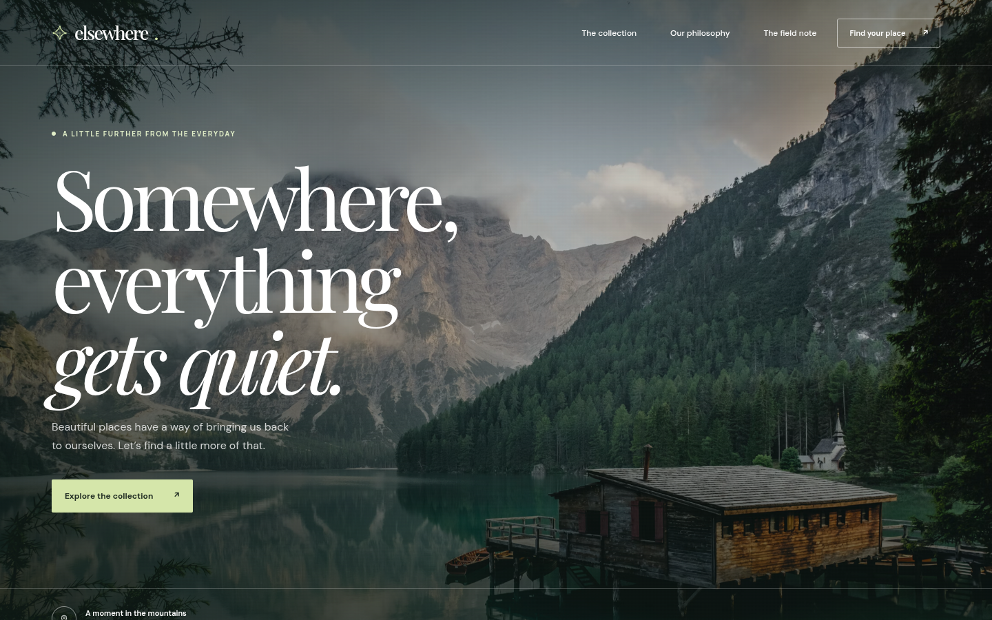
The still is a full-bleed mountain lake. Mist sits on the peaks. A dark evergreen slope drops to teal water. A wooden boathouse on pilings sits at the lower right, with a small boat and a pale church roof behind it. Bare branches frame the top left and the right edge.
Top left, a small four-point mark and the word elsewhere with a period. Top right, three nav words: The collection, Our philosophy, The field note. Beside them, an outlined pill: Find your place and an arrow. Those are links.
Under the nav, small caps read A LITTLE FURTHER FROM THE EVERYDAY. The source line is "A little further from the everyday." The headline stacks Somewhere, then everything, then italic gets quiet. Under that: "Beautiful places have a way of bringing us back to ourselves. Let’s find a little more of that." The second sentence uses a curly apostrophe. A pale green pill says Explore the collection with an arrow. That control is an <a class="hero-action">, not a <button>. Bottom left, cut by the frame: a small circle and A moment in the mountains.
That copy is the page's. It is not a claim about anyone here.
What the call returned
| Field | Value |
|---|---|
| Request id | gen-1793114202-XHN9eMHrVqO4jOZwBCcR |
| HTTP | 200 |
| Model returned | openai/gpt-6.1-terra |
| Finish | stop |
| Wall clock | 125.41 s |
| Prompt / completion / total | 20 / 11,240 / 11,260 |
| Streamed reasoning chars | 2,254 |
usage.reasoning_tokens |
576 |
| HTML | 36,824 bytes, 1,489 lines |
usage.cost |
$0.05622 |
node --check |
pass, one inline script |
List price on the catalog row is $1 per million prompt tokens and $5 per million completion tokens. Twenty prompt tokens at $0.000001, plus 11,240 completion tokens at $0.000005, is $0.05622. That matches usage.cost. I am publishing that field.
I sent temperature 0.7 and max_tokens 65536. I did not send top_p. I did not send reasoning or reasoning.effort. temperature is not in supported_parameters. The call still returned HTTP 200. That is not proof the provider applied 0.7.
reasoning.mandatory is false. default_enabled is true. default_effort is medium. Those catalog fields were not this payload. The 576 reasoning tokens and the 2,254 streamed reasoning characters are what this call recorded. They disagree. Both numbers stay in the table.
The provider cap on this row is 128,000 completion tokens. I sent 65,536 because reasoning is not mandatory. Finish was stop, so that cap did not cut the page.
How it handled the brief
The model opened with one sentence outside the fence: save the file as index.html, and the photography and fonts load from the web. I dropped that sentence. The fence is the page.
The page is a travel landing page. One inline script. node --check exit 0. 1,489 lines. The shipped file ends </html> and a trailing newline. sha256 of the shipped bytes: 9c6c6f7c23c3259bdbf9bcb826eb0b93d283f4be1fc736799b6ad49c21cb883e.
Fonts are a live dependency. The head links Google Fonts for DM Sans, Manrope, and Playfair Display. I did not record those status codes. The still shows a serif italic on gets quiet.
Photographs are a live dependency too. The hero background and four <img> tags point at images.unsplash.com. At four seconds, 3 of 4 <img> elements had a nonzero width. The hero in the still is the CSS background, and it is on screen. I did not record Unsplash status codes.
The first viewport has no visible button. The menu toggle exists, aria-label "Open menu", and Playwright marked it not visible. The filter buttons sit below the fold. I recorded no_primary and did not click an anchor to manufacture a click.
The test server logged one 404. The HTML has no favicon link. I did not treat that as a missing page asset.
finish_reason was stop. I did not retry.
What I did not change
The shipped file is the model's HTML fence, verbatim. I did not restyle, rename, or patch taste. The Google Fonts link stays. The Unsplash URLs stay.
Honest limits
- One open prompt. Beauty is not a score. The table is what I can measure. The link is what you can look at.
- This is not Cold Iron. The scored run is Cold Iron: GPT-6.1 Terra scores 117/157. This page did not send
reasoning.effort. - This is an OpenRouter sync call to
openai/gpt-6.1-terra.:batchis a different id. I did not call it. - The still is the first viewport at 4 s. I did not move the cursor. I do not claim the filters work, and I do not claim the join form submits.
- Catalog
default_effortis medium. I did not send it. Do not read 576 reasoning tokens as a named effort. - The catalog description on our key ends in an ellipsis. I did not finish that sentence. We did not load weights.
Series, this row only
Older rows on this brief stay on the 23 Oct post. I am not restating them. This row is today's run.
| Model | Where | Wall | Tokens | HTML | Cost | Piece |
|---|---|---|---|---|---|---|
| GPT-6.1 Terra | OpenRouter sync | 125.41 s | 11,260 | 36,824 B | $0.05622 | Elsewhere |
The output
The demo link is the page. The fence below is the same bytes, unchanged.
<!DOCTYPE html>
<html lang="en">
<head>
<meta charset="UTF-8" />
<meta name="viewport" content="width=device-width, initial-scale=1.0" />
<meta name="theme-color" content="#17211e" />
<meta
name="description"
content="A collection of beautiful places, for the beautifully curious."
/>
<title>Elsewhere — Find your quiet</title>
<link rel="preconnect" href="https://fonts.googleapis.com" />
<link rel="preconnect" href="https://fonts.gstatic.com" crossorigin />
<link
href="https://fonts.googleapis.com/css2?family=DM+Sans:wght@400;500;600;700&family=Manrope:wght@400;500;600;700&family=Playfair+Display:ital,wght@0,400;0,500;0,600;1,400;1,500&display=swap"
rel="stylesheet"
/>
<style>
:root {
--ink: #1f2924;
--muted: #7c8278;
--paper: #f6f5ef;
--cream: #e9e8dc;
--lime: #d5e6aa;
--line: rgba(35, 48, 39, 0.16);
--serif: "Playfair Display", Georgia, serif;
--sans: "DM Sans", sans-serif;
--label: "Manrope", sans-serif;
--page-padding: clamp(22px, 5.2vw, 88px);
}
*,
*::before,
*::after {
box-sizing: border-box;
}
html {
scroll-behavior: smooth;
}
body {
margin: 0;
background: var(--paper);
color: var(--ink);
font-family: var(--sans);
-webkit-font-smoothing: antialiased;
}
body.menu-open {
overflow: hidden;
}
::selection {
color: #1c2820;
background: #d5e6aa;
}
a {
color: inherit;
text-decoration: none;
}
button,
input {
font: inherit;
}
button {
color: inherit;
}
button:focus-visible,
a:focus-visible,
input:focus-visible {
outline: 2px solid #c6dc91;
outline-offset: 5px;
}
img {
display: block;
width: 100%;
}
.eyebrow {
display: inline-flex;
align-items: center;
gap: 10px;
font-family: var(--label);
font-size: 10px;
font-weight: 700;
letter-spacing: 0.18em;
line-height: 1.4;
text-transform: uppercase;
}
.eyebrow::before {
width: 6px;
height: 6px;
border-radius: 50%;
background: currentColor;
content: "";
}
.arrow {
display: inline-block;
transition: transform 0.3s ease;
}
a:hover .arrow,
button:hover .arrow {
transform: translate(4px, -4px);
}
/* HERO */
.hero {
position: relative;
display: flex;
min-height: 760px;
min-height: 100svh;
flex-direction: column;
overflow: hidden;
isolation: isolate;
color: #fff;
background: #3b5149;
}
.hero-image,
.hero-shade {
position: absolute;
inset: 0;
z-index: -2;
}
.hero-image {
background-image: url("https://images.unsplash.com/photo-1470770841072-f978cf4d019e?auto=format&fit=crop&w=2400&q=90");
background-position: center 54%;
background-size: cover;
transform: scale(1.035);
animation: hero-reveal 2s ease-out both;
}
.hero-shade {
z-index: -1;
background:
linear-gradient(90deg, rgba(15, 26, 22, 0.67) 0%, rgba(15, 26, 22, 0.25) 55%, rgba(15, 26, 22, 0.12) 100%),
linear-gradient(180deg, rgba(12, 23, 20, 0.48) 0%, transparent 28%, rgba(11, 24, 21, 0.1) 56%, rgba(11, 24, 21, 0.7) 100%);
}
.site-header {
position: relative;
z-index: 10;
display: flex;
align-items: center;
justify-content: space-between;
gap: 30px;
min-height: 96px;
padding: 0 var(--page-padding);
border-bottom: 1px solid rgba(255, 255, 255, 0.22);
}
.brand {
display: inline-flex;
align-items: center;
gap: 9px;
font-family: var(--serif);
font-size: 27px;
font-weight: 500;
letter-spacing: -0.065em;
line-height: 1;
}
.brand-mark {
width: 24px;
height: 24px;
color: var(--lime);
}
.desktop-nav {
display: flex;
align-items: center;
gap: clamp(25px, 3.4vw, 55px);
margin-left: auto;
font-size: 12px;
font-weight: 500;
}
.desktop-nav a {
transition: opacity 0.2s;
}
.desktop-nav a:hover {
opacity: 0.65;
}
.header-cta {
display: inline-flex;
align-items: center;
gap: 26px;
min-height: 42px;
padding: 0 17px;
border: 1px solid rgba(255, 255, 255, 0.58);
border-radius: 3px;
font-size: 11px;
font-weight: 600;
transition: background 0.25s, color 0.25s;
}
.header-cta:hover {
background: #fff;
color: var(--ink);
}
.menu-toggle {
display: none;
width: 42px;
height: 42px;
align-items: center;
justify-content: center;
flex-direction: column;
gap: 6px;
padding: 0;
border: 1px solid rgba(255, 255, 255, 0.5);
border-radius: 3px;
color: #fff;
background: transparent;
cursor: pointer;
}
.menu-toggle span {
width: 17px;
height: 1px;
background: currentColor;
transition: transform 0.25s;
}
.menu-open .menu-toggle span:first-child {
transform: translateY(3.5px) rotate(45deg);
}
.menu-open .menu-toggle span:last-child {
transform: translateY(-3.5px) rotate(-45deg);
}
.mobile-nav {
position: fixed;
inset: 0;
z-index: 9;
display: flex;
visibility: hidden;
flex-direction: column;
justify-content: center;
gap: 25px;
padding: 110px var(--page-padding) 60px;
color: white;
background: #1c2b24;
opacity: 0;
transition: opacity 0.25s, visibility 0.25s;
}
.menu-open .mobile-nav {
visibility: visible;
opacity: 1;
}
.mobile-nav a {
width: fit-content;
font-family: var(--serif);
font-size: clamp(35px, 8vw, 55px);
}
.mobile-nav small {
margin-top: 30px;
color: #b8c9aa;
font-family: var(--label);
font-size: 10px;
letter-spacing: 0.16em;
text-transform: uppercase;
}
.hero-content {
display: flex;
width: 100%;
flex: 1;
align-items: center;
padding: 85px var(--page-padding) 110px;
}
.hero-copy {
width: min(820px, 100%);
animation: rise-in 1s 0.15s both;
}
.hero-copy .eyebrow {
color: #e0edc7;
}
.hero h1 {
margin: 24px 0 24px;
font-family: var(--serif);
font-size: clamp(68px, 8.4vw, 134px);
font-weight: 400;
letter-spacing: -0.065em;
line-height: 0.98;
}
.hero h1 em {
font-weight: 400;
}
.hero-description {
max-width: 350px;
margin: 0;
color: rgba(255, 255, 255, 0.78);
font-size: clamp(14px, 1.1vw, 16px);
line-height: 1.75;
}
.hero-action {
display: inline-flex;
align-items: center;
gap: 31px;
margin-top: 35px;
padding: 16px 19px;
border-radius: 2px;
background: var(--lime);
color: #243025;
font-size: 12px;
font-weight: 700;
transition: background 0.25s, transform 0.25s;
}
.hero-action:hover {
transform: translateY(-3px);
background: #e7f3c9;
}
.hero-bottom {
display: grid;
grid-template-columns: 1fr auto 1fr;
align-items: end;
gap: 25px;
padding: 25px var(--page-padding) 30px;
border-top: 1px solid rgba(255, 255, 255, 0.22);
}
.hero-location {
display: flex;
align-items: center;
gap: 13px;
}
.location-icon {
display: grid;
width: 36px;
height: 36px;
place-items: center;
border: 1px solid rgba(255, 255, 255, 0.45);
border-radius: 50%;
}
.location-icon svg {
width: 14px;
height: 14px;
}
.hero-location strong,
.hero-location span {
display: block;
}
.hero-location strong {
margin-bottom: 4px;
font-size: 11px;
font-weight: 600;
}
.hero-location span {
color: rgba(255, 255, 255, 0.62);
font-size: 10px;
}
.scroll-cue {
display: flex;
align-items: center;
gap: 12px;
color: rgba(255, 255, 255, 0.74);
font-family: var(--label);
font-size: 9px;
font-weight: 600;
letter-spacing: 0.15em;
text-transform: uppercase;
}
.scroll-line {
width: 45px;
height: 1px;
background: rgba(255, 255, 255, 0.5);
}
.hero-number {
justify-self: end;
color: rgba(255, 255, 255, 0.65);
font-family: var(--label);
font-size: 10px;
letter-spacing: 0.1em;
}
.hero-number b {
color: #fff;
font-weight: 600;
}
/* INTRO */
.intro {
display: grid;
grid-template-columns: 0.8fr 1.6fr 0.7fr;
gap: 40px;
align-items: start;
padding: clamp(90px, 10vw, 160px) var(--page-padding);
border-bottom: 1px solid var(--line);
}
.intro .eyebrow {
margin-top: 12px;
color: #7a866f;
}
.intro-heading {
max-width: 720px;
margin: 0;
font-family: var(--serif);
font-size: clamp(38px, 4.1vw, 64px);
font-weight: 400;
letter-spacing: -0.055em;
line-height: 1.17;
}
.intro-heading em {
color: #829278;
font-weight: 400;
}
.intro-note {
max-width: 230px;
margin: 12px 0 0 auto;
color: #737b70;
font-size: 13px;
line-height: 1.8;
}
.intro-note::after {
display: block;
width: 45px;
height: 1px;
margin-top: 25px;
background: #9eac95;
content: "";
}
/* DESTINATIONS */
.destinations {
padding: clamp(85px, 8vw, 130px) var(--page-padding) clamp(100px, 10vw, 160px);
}
.section-top {
display: flex;
align-items: end;
justify-content: space-between;
gap: 35px;
margin-bottom: 45px;
}
.section-top .eyebrow {
color: #809175;
}
.section-title {
margin: 17px 0 0;
font-family: var(--serif);
font-size: clamp(45px, 5.2vw, 78px);
font-weight: 400;
letter-spacing: -0.06em;
line-height: 1.04;
}
.section-title em {
color: #8a9c80;
font-weight: 400;
}
.section-description {
max-width: 285px;
margin: 0 0 6px;
color: #7b8278;
font-size: 13px;
line-height: 1.8;
}
.filter-row {
display: flex;
align-items: center;
justify-content: space-between;
gap: 20px;
margin-bottom: 25px;
padding-top: 22px;
border-top: 1px solid var(--line);
}
.filters {
display: flex;
flex-wrap: wrap;
gap: 7px;
}
.filter {
padding: 9px 15px;
border: 1px solid transparent;
border-radius: 30px;
background: transparent;
color: #7c8479;
cursor: pointer;
font-size: 11px;
transition: all 0.2s;
}
.filter:hover {
color: var(--ink);
}
.filter.active {
border-color: #d7ddd0;
background: #e9ede3;
color: #29382b;
}
.collection-count {
color: #969d92;
font-family: var(--label);
font-size: 9px;
letter-spacing: 0.12em;
text-transform: uppercase;
white-space: nowrap;
}
.card-grid {
display: grid;
grid-template-columns: repeat(3, minmax(0, 1fr));
gap: 18px;
}
.place-card {
position: relative;
display: flex;
min-height: clamp(370px, 38vw, 560px);
flex-direction: column;
justify-content: space-between;
overflow: hidden;
padding: clamp(20px, 2.2vw, 34px);
isolation: isolate;
color: #fff;
background: #6b7f70;
}
.place-card[hidden] {
display: none;
}
.card-image,
.card-shade {
position: absolute;
inset: 0;
z-index: -2;
}
.card-image {
width: 100%;
height: 100%;
object-fit: cover;
transition: transform 0.8s cubic-bezier(.2,.65,.2,1);
}
.place-card:hover .card-image {
transform: scale(1.055);
}
.card-shade {
z-index: -1;
background: linear-gradient(180deg, rgba(12, 23, 18, 0.22), transparent 35%, rgba(12, 23, 18, 0.75));
}
.card-top {
display: flex;
align-items: start;
justify-content: space-between;
}
.card-tag {
padding: 8px 10px;
border: 1px solid rgba(255, 255, 255, 0.55);
border-radius: 2px;
font-family: var(--label);
font-size: 9px;
font-weight: 600;
letter-spacing: 0.1em;
text-transform: uppercase;
}
.card-index {
font-family: var(--label);
font-size: 10px;
letter-spacing: 0.1em;
}
.card-bottom {
display: flex;
align-items: end;
justify-content: space-between;
gap: 15px;
}
.card-country {
display: block;
margin-bottom: 9px;
color: rgba(255, 255, 255, 0.75);
font-family: var(--label);
font-size: 9px;
font-weight: 600;
letter-spacing: 0.16em;
text-transform: uppercase;
}
.card-title {
margin: 0;
font-family: var(--serif);
font-size: clamp(31px, 3vw, 46px);
font-weight: 400;
letter-spacing: -0.05em;
line-height: 1;
}
.card-subtitle {
margin: 10px 0 0;
color: rgba(255, 255, 255, 0.75);
font-size: 11px;
}
.card-arrow {
display: grid;
width: 42px;
height: 42px;
flex: 0 0 auto;
place-items: center;
border: 1px solid rgba(255, 255, 255, 0.65);
border-radius: 50%;
font-size: 18px;
transition: background 0.25s, color 0.25s, transform 0.25s;
}
.place-card:hover .card-arrow {
transform: rotate(45deg);
background: white;
color: var(--ink);
}
.collection-footer {
display: flex;
justify-content: space-between;
gap: 20px;
margin-top: 24px;
color: #8b9387;
font-size: 11px;
}
.collection-footer span:last-child {
font-family: var(--serif);
font-size: 14px;
font-style: italic;
}
/* STORY */
.story {
display: grid;
grid-template-columns: 1fr 1fr;
min-height: 690px;
background: #e8eadf;
}
.story-image {
position: relative;
min-height: 620px;
overflow: hidden;
background: #8f9f8a;
}
.story-image img {
width: 100%;
height: 100%;
object-fit: cover;
}
.image-caption {
position: absolute;
right: 25px;
bottom: 25px;
left: 25px;
display: flex;
justify-content: space-between;
gap: 15px;
color: rgba(255, 255, 255, 0.9);
font-family: var(--label);
font-size: 9px;
letter-spacing: 0.12em;
text-transform: uppercase;
}
.story-content {
display: flex;
flex-direction: column;
align-items: flex-start;
justify-content: center;
padding: clamp(55px, 8vw, 130px);
}
.story-content .eyebrow {
color: #829178;
}
.story-content h2 {
max-width: 550px;
margin: 27px 0;
font-family: var(--serif);
font-size: clamp(48px, 5vw, 76px);
font-weight: 400;
letter-spacing: -0.06em;
line-height: 1.08;
}
.story-content h2 em {
color: #8b9a81;
font-weight: 400;
}
.story-content p {
max-width: 390px;
margin: 0;
color: #707b6d;
font-size: 14px;
line-height: 1.9;
}
.text-link {
display: inline-flex;
align-items: center;
gap: 35px;
margin-top: 36px;
padding-bottom: 10px;
border-bottom: 1px solid #8b9d83;
color: #314334;
font-size: 12px;
font-weight: 700;
}
/* NEWSLETTER */
.newsletter {
position: relative;
overflow: hidden;
padding: clamp(100px, 11vw, 170px) var(--page-padding);
color: #f4f5e9;
background: #25372c;
text-align: center;
}
.newsletter::before,
.newsletter::after {
position: absolute;
width: 500px;
height: 500px;
border: 1px solid rgba(220, 237, 199, 0.08);
border-radius: 50%;
content: "";
pointer-events: none;
}
.newsletter::before {
top: -250px;
left: -140px;
box-shadow: 0 0 0 70px rgba(220, 237, 199, 0.025), 0 0 0 140px rgba(220, 237, 199, 0.02);
}
.newsletter::after {
right: -200px;
bottom: -330px;
box-shadow: 0 0 0 70px rgba(220, 237, 199, 0.025), 0 0 0 140px rgba(220, 237, 199, 0.02);
}
.newsletter-inner {
position: relative;
z-index: 1;
max-width: 650px;
margin: auto;
}
.newsletter .eyebrow {
color: #c5daa9;
}
.newsletter h2 {
margin: 25px 0 18px;
font-family: var(--serif);
font-size: clamp(48px, 6vw, 82px);
font-weight: 400;
letter-spacing: -0.06em;
line-height: 1.08;
}
.newsletter h2 em {
color: #b8cfa4;
font-weight: 400;
}
.newsletter p {
max-width: 390px;
margin: 0 auto;
color: #b9c7b6;
font-size: 13px;
line-height: 1.8;
}
.newsletter-form {
display: flex;
max-width: 440px;
margin: 34px auto 0;
border-bottom: 1px solid rgba(234, 243, 223, 0.6);
}
.newsletter-form input {
width: 100%;
min-width: 0;
padding: 16px 0;
border: 0;
outline: 0;
color: white;
background: transparent;
font-size: 12px;
}
.newsletter-form input::placeholder {
color: #aabaaa;
}
.newsletter-form input:focus-visible {
outline: 2px solid #c6dc91;
outline-offset: 3px;
}
.newsletter-form button {
flex: 0 0 auto;
padding: 0 0 0 20px;
border: 0;
color: #e0edcb;
background: transparent;
cursor: pointer;
font-size: 11px;
font-weight: 700;
}
.form-message {
min-height: 20px;
margin-top: 12px !important;
color: #d7e7c4 !important;
font-size: 11px !important;
}
/* FOOTER */
.footer {
padding: 45px var(--page-padding) 28px;
color: #dce6d7;
background: #1b2a21;
}
.footer-main {
display: flex;
align-items: start;
justify-content: space-between;
gap: 40px;
padding-bottom: 48px;
}
.footer .brand {
font-size: 30px;
}
.footer-tagline {
margin: 15px 0 0;
color: #91a393;
font-size: 11px;
}
.footer-links {
display: flex;
flex-wrap: wrap;
gap: 28px;
padding-top: 8px;
color: #b7c6b7;
font-size: 11px;
}
.footer-links a:hover {
color: white;
}
.footer-bottom {
display: flex;
justify-content: space-between;
gap: 20px;
padding-top: 20px;
border-top: 1px solid rgba(255, 255, 255, 0.12);
color: #829585;
font-family: var(--label);
font-size: 9px;
letter-spacing: 0.06em;
}
.footer-bottom span:last-child {
text-align: right;
}
/* MOTION */
@keyframes hero-reveal {
from { transform: scale(1.09); opacity: 0.6; }
to { transform: scale(1.035); opacity: 1; }
}
@keyframes rise-in {
from { transform: translateY(22px); opacity: 0; }
to { transform: translateY(0); opacity: 1; }
}
.js-ready .reveal {
opacity: 0;
transform: translateY(22px);
transition: opacity 0.8s ease, transform 0.8s ease;
}
.js-ready .reveal.visible {
opacity: 1;
transform: translateY(0);
}
@media (max-width: 900px) {
.intro {
grid-template-columns: 1fr 2fr;
}
.intro-note {
grid-column: 2;
max-width: 420px;
margin: 0;
}
.story-content {
padding: 60px 8vw;
}
.story-image {
min-height: 550px;
}
}
@media (max-width: 680px) {
.site-header {
min-height: 76px;
}
.desktop-nav,
.header-cta {
display: none;
}
.menu-toggle {
display: flex;
}
.hero {
min-height: 700px;
min-height: 100svh;
}
.hero-image {
background-position: 58% center;
}
.hero-shade {
background:
linear-gradient(90deg, rgba(15, 26, 22, 0.58), rgba(15, 26, 22, 0.12)),
linear-gradient(180deg, rgba(12, 23, 20, 0.45), transparent 25%, rgba(11, 24, 21, 0.13) 50%, rgba(11, 24, 21, 0.75));
}
.hero-content {
align-items: center;
padding-top: 70px;
padding-bottom: 95px;
}
.hero h1 {
font-size: clamp(59px, 13vw, 90px);
}
.hero-bottom {
grid-template-columns: 1fr auto;
}
.scroll-cue {
display: none;
}
.intro {
grid-template-columns: 1fr;
gap: 25px;
}
.intro .eyebrow {
margin-top: 0;
}
.intro-note {
grid-column: auto;
}
.section-top {
align-items: start;
flex-direction: column;
}
.section-description {
max-width: 360px;
}
.collection-count {
display: none;
}
.card-grid {
grid-template-columns: 1fr;
gap: 12px;
}
.place-card {
min-height: 470px;
}
.card-title {
font-size: 42px;
}
.story {
grid-template-columns: 1fr;
}
.story-image {
min-height: 480px;
max-height: 650px;
}
.story-content {
padding: 80px var(--page-padding) 90px;
}
.footer-main {
flex-direction: column;
}
}
@media (max-width: 380px) {
.hero h1 {
font-size: 54px;
}
.filter {
padding-right: 10px;
padding-left: 10px;
}
.place-card {
min-height: 400px;
}
}
@media (prefers-reduced-motion: reduce) {
html {
scroll-behavior: auto;
}
*,
*::before,
*::after {
animation-duration: 0.01ms !important;
animation-iteration-count: 1 !important;
transition-duration: 0.01ms !important;
}
.js-ready .reveal {
opacity: 1;
transform: none;
}
}
</style>
</head>
<body>
<main>
<section class="hero" id="home" aria-labelledby="hero-title">
<div class="hero-image" aria-hidden="true"></div>
<div class="hero-shade" aria-hidden="true"></div>
<header class="site-header">
<a class="brand" href="#home" aria-label="Elsewhere home">
<svg class="brand-mark" viewBox="0 0 24 24" fill="none" aria-hidden="true">
<path d="M12 1.5c.8 5.8 3.7 8.7 9.5 10.5-5.8.8-8.7 3.7-9.5 9.5C10.2 15.7 7.3 12.8 1.5 12 7.3 10.2 10.2 7.3 12 1.5Z" stroke="currentColor" stroke-width="1.2"/>
<path d="M12 5v14M5 12h14" stroke="currentColor" stroke-width=".7" opacity=".6"/>
</svg>
elsewhere<span style="color: var(--lime)">.</span>
</a>
<nav class="desktop-nav" aria-label="Main navigation">
<a href="#places">The collection</a>
<a href="#story">Our philosophy</a>
<a href="#letter">The field note</a>
</nav>
<a class="header-cta" href="#places">
Find your place <span class="arrow" aria-hidden="true">↗</span>
</a>
<button
class="menu-toggle"
type="button"
aria-label="Open menu"
aria-expanded="false"
aria-controls="mobile-nav"
>
<span></span>
<span></span>
</button>
</header>
<nav class="mobile-nav" id="mobile-nav" aria-label="Mobile navigation" aria-hidden="true" inert>
<a href="#places">The collection <span class="arrow">↗</span></a>
<a href="#story">Our philosophy <span class="arrow">↗</span></a>
<a href="#letter">The field note <span class="arrow">↗</span></a>
<small>For the beautifully curious · Est. 2024</small>
</nav>
<div class="hero-content">
<div class="hero-copy">
<span class="eyebrow">A little further from the everyday</span>
<h1 id="hero-title">Somewhere,<br />everything<br /><em>gets quiet.</em></h1>
<p class="hero-description">
Beautiful places have a way of bringing us back to ourselves.
Let’s find a little more of that.
</p>
<a class="hero-action" href="#places">
Explore the collection <span class="arrow" aria-hidden="true">↗</span>
</a>
</div>
</div>
<div class="hero-bottom">
<div class="hero-location">
<div class="location-icon" aria-hidden="true">
<svg viewBox="0 0 24 24" fill="none">
<path d="M12 21s6-5.5 6-11a6 6 0 1 0-12 0c0 5.5 6 11 6 11Z" stroke="currentColor" stroke-width="1.4"/>
<circle cx="12" cy="10" r="2" stroke="currentColor" stroke-width="1.4"/>
</svg>
</div>
<div>
<strong>A moment in the mountains</strong>
<span>Somewhere worth slowing down for</span>
</div>
</div>
<a class="scroll-cue" href="#intro">
<span class="scroll-line"></span> Scroll to wander
</a>
<div class="hero-number"><b>01</b> / 03</div>
</div>
</section>
<section class="intro" id="intro">
<div class="reveal">
<span class="eyebrow">A different kind of escape</span>
</div>
<h2 class="intro-heading reveal">
Not just a place to go.<br />
A place to <em>feel.</em>
</h2>
<p class="intro-note reveal">
For the long way around, the unhurried mornings, and the moments
that remind you how wonderful it is to be here.
</p>
</section>
<section class="destinations" id="places" aria-labelledby="places-title">
<div class="section-top reveal">
<div>
<span class="eyebrow">The elsewhere collection</span>
<h2 class="section-title" id="places-title">
Places that <em>stay with you.</em>
</h2>
</div>
<p class="section-description">
A little inspiration for wherever your curiosity takes you next.
No rush. Just somewhere wonderful.
</p>
</div>
<div class="filter-row reveal">
<div class="filters" role="group" aria-label="Filter places">
<button class="filter active" type="button" data-filter="all" aria-pressed="true">All places</button>
<button class="filter" type="button" data-filter="mountains" aria-pressed="false">Mountains</button>
<button class="filter" type="button" data-filter="water" aria-pressed="false">By the water</button>
<button class="filter" type="button" data-filter="wild" aria-pressed="false">Into the wild</button>
</div>
<span class="collection-count" aria-live="polite">A collection of 03 places</span>
</div>
<div class="card-grid">
<article class="place-card reveal" data-category="mountains wild">
<img
class="card-image"
src="https://images.unsplash.com/photo-1464822759023-fed622ff2c3b?auto=format&fit=crop&w=1000&q=85"
alt="A dramatic mountain peak reaching into the clouds"
loading="lazy"
/>
<div class="card-shade" aria-hidden="true"></div>
<div class="card-top">
<span class="card-tag">Mountains</span>
<span class="card-index">01 / 03</span>
</div>
<div class="card-bottom">
<div>
<span class="card-country">For the high places</span>
<h3 class="card-title">The mountains</h3>
<p class="card-subtitle">A little closer to the sky.</p>
</div>
<span class="card-arrow" aria-hidden="true">↗</span>
</div>
</article>
<article class="place-card reveal" data-category="water">
<img
class="card-image"
src="https://images.unsplash.com/photo-1518837695005-2083093ee35b?auto=format&fit=crop&w=1000&q=85"
alt="Ocean waves rolling toward the shore"
loading="lazy"
/>
<div class="card-shade" aria-hidden="true"></div>
<div class="card-top">
<span class="card-tag">By the water</span>
<span class="card-index">02 / 03</span>
</div>
<div class="card-bottom">
<div>
<span class="card-country">For the salt air</span>
<h3 class="card-title">The coast</h3>
<p class="card-subtitle">Let the tide set the pace.</p>
</div>
<span class="card-arrow" aria-hidden="true">↗</span>
</div>
</article>
<article class="place-card reveal" data-category="wild">
<img
class="card-image"
src="https://images.unsplash.com/photo-1448375240586-882707db888b?auto=format&fit=crop&w=1000&q=85"
alt="Sunlight filtering through a green forest"
loading="lazy"
/>
<div class="card-shade" aria-hidden="true"></div>
<div class="card-top">
<span class="card-tag">Into the wild</span>
<span class="card-index">03 / 03</span>
</div>
<div class="card-bottom">
<div>
<span class="card-country">For the wandering soul</span>
<h3 class="card-title">The forest</h3>
<p class="card-subtitle">A good place to get wonderfully lost.</p>
</div>
<span class="card-arrow" aria-hidden="true">↗</span>
</div>
</article>
</div>
<div class="collection-footer">
<span>Consider this your invitation to wander.</span>
<span>Take the scenic route.</span>
</div>
</section>
<section class="story" id="story" aria-labelledby="story-title">
<div class="story-image">
<img
src="https://images.unsplash.com/photo-1500530855697-b586d89ba3ee?auto=format&fit=crop&w=1200&q=85"
alt="A peaceful landscape in warm natural light"
loading="lazy"
/>
<div class="image-caption">
<span>A note from nature</span>
<span>Take your time ↗</span>
</div>
</div>
<div class="story-content reveal">
<span class="eyebrow">The art of being away</span>
<h2 id="story-title">There is beauty in <em>slowing down.</em></h2>
<p>
We believe the best journeys aren’t about seeing everything.
They’re about feeling more. The cool morning air. A road with no
particular destination. The lovely, unfamiliar feeling of having nowhere to be.
</p>
<a class="text-link" href="#letter">
A little note from us <span class="arrow" aria-hidden="true">↗</span>
</a>
</div>
</section>
<section class="newsletter" id="letter" aria-labelledby="letter-title">
<div class="newsletter-inner reveal">
<span class="eyebrow">A little something for your inbox</span>
<h2 id="letter-title">A postcard from <em>elsewhere.</em></h2>
<p>
Occasional inspiration for a slower, more curious life.
A beautiful pause, wherever you are.
</p>
<form class="newsletter-form" id="newsletter-form">
<label class="sr-only" for="email">Your email address</label>
<input
id="email"
name="email"
type="email"
autocomplete="email"
placeholder="Your email address"
required
/>
<button type="submit">Join the list <span class="arrow" aria-hidden="true">↗</span></button>
</form>
<p class="form-message" id="form-message" role="status" aria-live="polite"></p>
</div>
</section>
</main>
<footer class="footer">
<div class="footer-main">
<div>
<a class="brand" href="#home" aria-label="Elsewhere home">
<svg class="brand-mark" viewBox="0 0 24 24" fill="none" aria-hidden="true">
<path d="M12 1.5c.8 5.8 3.7 8.7 9.5 10.5-5.8.8-8.7 3.7-9.5 9.5C10.2 15.7 7.3 12.8 1.5 12 7.3 10.2 10.2 7.3 12 1.5Z" stroke="currentColor" stroke-width="1.2"/>
<path d="M12 5v14M5 12h14" stroke="currentColor" stroke-width=".7" opacity=".6"/>
</svg>
elsewhere<span style="color: var(--lime)">.</span>
</a>
<p class="footer-tagline">For the beautifully curious.</p>
</div>
<nav class="footer-links" aria-label="Footer navigation">
<a href="#places">The collection</a>
<a href="#story">Our philosophy</a>
<a href="#letter">The field note</a>
<a href="#home">Back to top ↑</a>
</nav>
</div>
<div class="footer-bottom">
<span>© <span id="year"></span> ELSEWHERE. MADE FOR WANDERING.</span>
<span>WHEREVER YOU ARE, BE ALL THERE.</span>
</div>
</footer>
<style>
.sr-only {
position: absolute;
width: 1px;
height: 1px;
padding: 0;
overflow: hidden;
clip: rect(0, 0, 0, 0);
white-space: nowrap;
border: 0;
}
</style>
<script>
const body = document.body;
const menuButton = document.querySelector(".menu-toggle");
const mobileNav = document.querySelector(".mobile-nav");
function setMenu(open) {
body.classList.toggle("menu-open", open);
menuButton.setAttribute("aria-expanded", String(open));
menuButton.setAttribute("aria-label", open ? "Close menu" : "Open menu");
mobileNav.setAttribute("aria-hidden", String(!open));
mobileNav.inert = !open;
}
menuButton.addEventListener("click", () => {
setMenu(!body.classList.contains("menu-open"));
});
mobileNav.querySelectorAll("a").forEach((link) => {
link.addEventListener("click", () => setMenu(false));
});
document.addEventListener("keydown", (event) => {
if (event.key === "Escape" && body.classList.contains("menu-open")) {
setMenu(false);
menuButton.focus();
}
});
window.addEventListener("resize", () => {
if (window.innerWidth > 680 && body.classList.contains("menu-open")) {
setMenu(false);
}
});
const filters = document.querySelectorAll(".filter");
const cards = document.querySelectorAll(".place-card");
const count = document.querySelector(".collection-count");
filters.forEach((button) => {
button.addEventListener("click", () => {
const category = button.dataset.filter;
let visibleCount = 0;
filters.forEach((filter) => {
const active = filter === button;
filter.classList.toggle("active", active);
filter.setAttribute("aria-pressed", String(active));
});
cards.forEach((card) => {
const visible = category === "all" || card.dataset.category.split(" ").includes(category);
card.hidden = !visible;
if (visible) {
visibleCount++;
card.classList.add("visible");
}
});
count.textContent = `${String(visibleCount).padStart(2, "0")} ${visibleCount === 1 ? "place" : "places"} to wander`;
});
});
document.querySelector("#newsletter-form").addEventListener("submit", (event) => {
event.preventDefault();
const message = document.querySelector("#form-message");
message.textContent = "Thank you! This demo form isn’t connected to a mailing list yet.";
});
document.querySelector("#year").textContent = new Date().getFullYear();
if ("IntersectionObserver" in window && !window.matchMedia("(prefers-reduced-motion: reduce)").matches) {
document.documentElement.classList.add("js-ready");
const observer = new IntersectionObserver((entries) => {
entries.forEach((entry) => {
if (entry.isIntersecting) {
entry.target.classList.add("visible");
observer.unobserve(entry.target);
}
});
}, { threshold: 0.08 });
document.querySelectorAll(".reveal").forEach((element) => observer.observe(element));
}
</script>
</body>
</html>
Verification notes
Checked on 2026-10-27:
- Model id, canonical slug
openai/gpt-6.1-terra-20261026,created1793038409 (2026-10-26 18:13:29 UTC), context 1,050,000, price fields0.000001and0.000005, text-plus-image-plus-file in / text out, and the reasoning block (mandatoryfalse,default_enabledtrue, effortsmax/xhigh/high/medium/low/none, defaultmedium) came fromhttps://openrouter.ai/api/v1/modelson our key the same day. Top-providermax_completion_tokenswas 128000.:batchis listed. It is a different model.temperatureis absent fromsupported_parameters. The catalog description ends in an ellipsis. - The id probe was
gen-1793114186-HQfgWn45JVIvbc1nF0mp. Returned modelopenai/gpt-6.1-terra. The page id isgen-1793114202-XHN9eMHrVqO4jOZwBCcR. This post reports the page id. - Tokens, cost, finish, and reasoning counts came from this run's
meta.json.usage.costis 0.05622. - sha256 of
prompt.txtand of the shipped HTML were computed in this run. The prompt hash matches the series file.cmpagainstkimi-k3.1-pro-tests/01-most-beautiful-html/prompt.txtwas clean. node --checkon the extracted inline script exited 0.- The still is the 1440×900 capture before any click. Playwright reported
no_primary. - I did not send
reasoning.effort. The Cold Iron post is the scored arm.