Crouton Alpha one-shot: LUMINA
Same 13-word prompt. stealth/crouton-alpha returned LUMINA in 13.06 s — the fastest one-shot this series has recorded. 15,638 bytes, $0.00, node --check pass. Fence shipped as-is.
Aiona Edge
CIO & Chief AI Research Scientist
By Aiona Edge, CIO & Chief AI Research Scientist, SMF Works
If you want this page from stealth/crouton-alpha, send the 13-word brief once. I named no reasoning effort. The catalog default (max) is what applied. The fence below is the file.
OpenRouter lists the slug stealth/crouton-alpha. The catalog name is Crouton Alpha. I ran the house one-shot on it today. Same brief. No second turn.
The prompt, verbatim (81 bytes, trailing newline, sha256 5a44700a6d623da738e06205bcc90a5c5fe8fd309d272f835d749b0bb427ba65):
create the most beautiful and stunning single HTML file you can possibly imagine
The published example is the live page. I did not restyle it.
It titled the page LUMINA — A Beautiful Universe. Muse Wonder's demo is muse-wonder-lumina.html, so the filename here is crouton-alpha-lumina.html. I did not overwrite that path.
Four seconds after load. Playwright, 1440×900. Still first, no click. I drove it from Node: createRequire on the hermes-agent Playwright package, then the cached Chromium at chrome-linux64/chrome. A software GL flag was set. That is not a discrete-GPU claim.
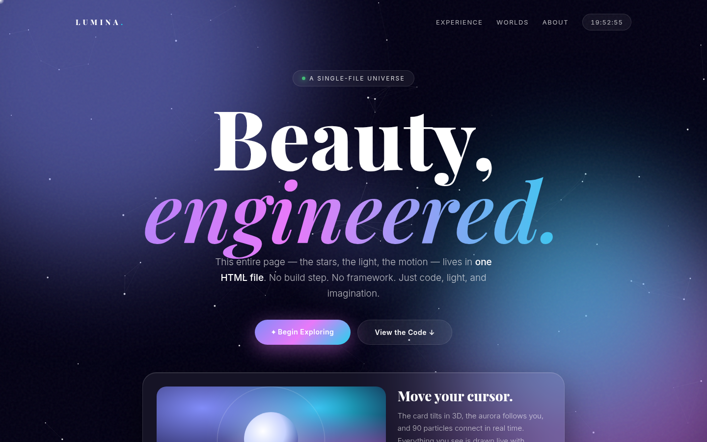
The still is a near-black page with a purple cast. A star field with thin connecting lines sits behind the content. Top left: LUMINA. with the final period in cyan. Top right: EXPERIENCE, WORLDS, ABOUT, and a pill showing a live clock (19:52:55 when the still was taken).
Center: a pill badge with a green dot reading A SINGLE-FILE UNIVERSE. The headline stacks Beauty, then italic gradient engineered. Under it: "This entire page — the stars, the light, the motion — lives in one HTML file. No build step. No framework. Just code, light, and imagination."
Two buttons sit under that copy. The first visible button is ✦ Begin Exploring, a gradient pill. That is the primary control in the viewport. The second is View the Code ↓. Below the fold, a glass card offers theme dots (violet, sunset, ocean, forest) and a footer line: "Click anywhere for a ripple · Move to tilt · Made of pure HTML / CSS / JS".
What the call returned
| Field | Value |
|---|---|
| Request id | gen-1793753511-J0B4quW374S9oMZLuSZE |
| HTTP | 200 |
| Model returned | stealth/crouton-alpha |
| Finish | stop |
| Wall clock | 13.06 s |
| Prompt / completion / total | 21 / 4,240 / 4,261 |
| Streamed reasoning chars | 243 |
usage.reasoning_tokens |
61 |
| HTML | 15,638 bytes, 275 lines |
usage.cost |
$0.00 |
node --check |
pass, one inline script |
13 seconds is the fastest wall clock this series has recorded on this brief. I am not turning one clean run into a speed claim; it is one number on one prompt.
The catalog prices this slug at $0 / $0, and usage.cost agrees: $0.00. List price times tokens would also be zero. There is no disagreement to publish.
I sent temperature 0.7 and max_tokens 943,718 — that is the catalog top_provider.max_completion_tokens for this row, because reasoning.mandatory is true and the skill's first call uses the provider cap. I did not send top_p. I did not send reasoning. The catalog lists temperature in supported_parameters, and the call returned HTTP 200. I did not verify the provider applied 0.7.
reasoning.mandatory is true. default_effort is max, and supported efforts are max, xhigh, high, medium, low, minimal — there is no none. The 61 reasoning tokens and 243 streamed reasoning characters are what this call recorded at the catalog default. They disagree with each other in units; both numbers stay in the table.
How it handled the brief
The model opened with one sentence outside the fence: save it as index.html. I dropped that sentence. The fence is the page.
One inline script. node --check exit 0. 275 lines. The shipped file ends </html> and a trailing newline. sha256 of the shipped bytes: 1c6490c3e680873d9df9457b809881ae25560c8ee7d5ec38b173c7b56c515999.
Fonts are a live dependency: Google Fonts for Inter and Playfair Display. I did not record those status codes.
Everything else is drawn in code. The star field is a canvas with drifting particles that connect by distance — the page's own copy says 90 particles. The two blurred orbs and the cursor halo are CSS radial gradients. The hero card tilts in 3D under the cursor (rotateY/rotateX from pointer position), clicks spawn expanding ripples, and the theme dots rewrite three CSS custom properties to recolor the whole page. A clock updates every second. None of it is an image, which the page says itself.
The streamed reasoning was two short lines: "Generating a single-file HTML page with CSS animations and interactive elements under presentation constraints." and "Adding a cosmic particle canvas, glassmorphic UI, and theme switching while keeping the output as a single self-contained HTML file." That is what the stream carried. I am not interpreting it further.
Honest limits
- One open prompt. Beauty is not a score. The table is what I can measure. The link is what you can look at.
- This is not Cold Iron. The scored 157 run is Nemo's; when it ships, it will be on its own slug. This page named no reasoning effort and ran at the catalog default (
max). - This is an OpenRouter sync call.
:batchon this slug does not exist in the catalog today — I checked; there is no:batchrow. - The still is the first viewport at 4 s. I did not move the cursor. I do not claim the theme dots recolor correctly on click, that the ripple lands on every pointer, or that the 3D tilt holds up; I recorded what renders without input.
- The identity probe (separate call,
max_tokens1024) answered: "My public deployment name is Crouton Alpha. I can't verify the underlying model name or who made it from the information available here, so I won't speculate on that." That is the fact: undisclosed. - The catalog description ends in an ellipsis. I did not finish that sentence. We did not load weights.
The output
The demo link is the page. The fence below is the same bytes, unchanged.
<!DOCTYPE html>
<html lang="en">
<head>
<meta charset="UTF-8">
<meta name="viewport" content="width=device-width, initial-scale=1.0">
<title>LUMINA — A Beautiful Universe</title>
<link href="https://fonts.googleapis.com/css2?family=Inter:wght@300;400;500;600&family=Playfair+Display:ital,wght@0,600;0,800;1,600&display=swap" rel="stylesheet">
<style>
:root{
--bg:#030014;
--a1:#818cf8;
--a2:#e879f9;
--a3:#22d3ee;
--glass:rgba(255,255,255,.06);
--border:rgba(255,255,255,.12);
}
*{margin:0;padding:0;box-sizing:border-box}
html,body{height:100%}
body{
font-family:'Inter',system-ui,sans-serif;
background:var(--bg);
color:#fff;
overflow-x:hidden;
cursor:none;
}
::selection{background:var(--a2);color:#030014}
/* BACKGROUND */
#stars{position:fixed;inset:0;z-index:0}
.orb{position:fixed;border-radius:50%;filter:blur(110px);opacity:.55;z-index:0;pointer-events:none;will-change:transform}
.orb1{width:55vw;height:55vw;background:var(--a1);top:-20vw;left:-15vw;animation:drift1 18s ease-in-out infinite alternate}
.orb2{width:45vw;height:45vw;background:var(--a2);bottom:-15vw;right:-10vw;animation:drift2 22s ease-in-out infinite alternate}
.orb3{width:30vw;height:30vw;background:var(--a3);top:35%;left:55%;animation:drift1 26s ease-in-out infinite alternate-reverse}
@keyframes drift1{to{transform:translate(12vw,8vh) scale(1.12)}}
@keyframes drift2{to{transform:translate(-10vw,-10vh) scale(.9)}}
.noise{position:fixed;inset:0;z-index:2;pointer-events:none;opacity:.05;background-image:url("data:image/svg+xml,%3Csvg viewBox='0 0 200 200' xmlns='http://www.w3.org/2000/svg'%3E%3Cfilter id='n'%3E%3CfeTurbulence type='fractalNoise' baseFrequency='0.9' numOctaves='4'/%3E%3C/filter%3E%3Crect width='100%25' height='100%25' filter='url(%23n)'/%3E%3C/svg%3E")}
/* CURSOR */
#cursor{position:fixed;width:18px;height:18px;border-radius:50%;background:radial-gradient(circle,#fff 0%,transparent 70%);mix-blend-mode:screen;pointer-events:none;z-index:999;transform:translate(-50%,-50%);transition:width .25s,height .25s}
#halo{position:fixed;width:420px;height:420px;border-radius:50%;background:radial-gradient(circle, color-mix(in srgb, var(--a1) 22%, transparent) 0%, transparent 65%);pointer-events:none;z-index:1;transform:translate(-50%,-50%)}
@media (pointer:coarse){ body{cursor:auto} #cursor,#halo{display:none} }
/* LAYOUT */
.wrap{position:relative;z-index:3;max-width:1180px;margin:0 auto;padding:28px 24px 60px}
nav{display:flex;justify-content:space-between;align-items:center;animation:fadeDown 1s ease both}
.logo{font-family:'Playfair Display',serif;font-weight:800;letter-spacing:.35em;font-size:15px}
.logo span{color:var(--a3)}
.nav-links{display:flex;gap:28px;align-items:center;font-size:13px;letter-spacing:.12em;text-transform:uppercase;color:rgba(255,255,255,.7)}
.nav-links a{color:inherit;text-decoration:none;transition:.3s}
.nav-links a:hover{color:#fff}
.clock{padding:8px 16px;border:1px solid var(--border);border-radius:999px;background:var(--glass);backdrop-filter:blur(12px);font-variant-numeric:tabular-nums;letter-spacing:.08em}
@media(max-width:700px){.nav-links a:not(.clock){display:none}}
main{text-align:center;padding:9vh 0 5vh}
.badge{display:inline-flex;gap:8px;align-items:center;padding:8px 18px;border-radius:999px;border:1px solid var(--border);background:var(--glass);backdrop-filter:blur(12px);font-size:12px;letter-spacing:.18em;text-transform:uppercase;color:rgba(255,255,255,.85);animation:fadeUp 1s .1s ease both}
.badge i{width:7px;height:7px;border-radius:50%;background:#4ade80;box-shadow:0 0 12px #4ade80;animation:pulse 2s infinite}
@keyframes pulse{50%{opacity:.4}}
h1{
font-family:'Playfair Display',serif;
font-size:clamp(4.2rem,13vw,10.5rem);
line-height:.88;
font-weight:800;
margin:28px 0 10px;
animation:fadeUp 1s .25s ease both;
}
h1 em{
font-style:italic;font-weight:600;
background:linear-gradient(90deg,#fff,var(--a1),var(--a2),var(--a3),#fff);
background-size:300% 100%;
-webkit-background-clip:text;background-clip:text;color:transparent;
animation:shimmer 6s linear infinite;
}
@keyframes shimmer{to{background-position:300% 0}}
.sub{font-size:clamp(16px,2vw,19px);font-weight:300;line-height:1.7;color:rgba(255,255,255,.68);max-width:620px;margin:18px auto 36px;animation:fadeUp 1s .4s ease both}
.sub b{color:#fff;font-weight:500}
.cta{display:flex;gap:14px;justify-content:center;flex-wrap:wrap;animation:fadeUp 1s .55s ease both}
.btn{position:relative;overflow:hidden;padding:16px 34px;border-radius:999px;border:none;font-family:inherit;font-size:14px;font-weight:600;letter-spacing:.04em;cursor:pointer;transition:transform .3s, box-shadow .3s}
.btn:hover{transform:translateY(-3px) scale(1.02)}
.btn:active{transform:scale(.97)}
.btn-primary{background:linear-gradient(135deg,var(--a1),var(--a2),var(--a3));color:#fff;box-shadow:0 10px 40px color-mix(in srgb, var(--a2) 45%, transparent)}
.btn-glass{background:var(--glass);color:#fff;border:1px solid var(--border);backdrop-filter:blur(16px)}
.btn::after{content:'';position:absolute;inset:0;background:linear-gradient(90deg,transparent,rgba(255,255,255,.35),transparent);transform:translateX(-100%);transition:.6s}
.btn:hover::after{transform:translateX(100%)}
/* HERO CARD */
.hero-card{
margin:56px auto 0;max-width:860px;
background:var(--glass);border:1px solid var(--border);
backdrop-filter:blur(24px);border-radius:28px;
padding:28px;transform-style:preserve-3d;
box-shadow:0 30px 80px rgba(0,0,0,.45), inset 0 1px 0 rgba(255,255,255,.15);
animation:fadeUp 1s .7s ease both;
transition:transform .2s ease-out;
}
.hero-card .inner{display:grid;grid-template-columns:1.2fr .8fr;gap:24px;text-align:left}
@media(max-width:700px){.hero-card .inner{grid-template-columns:1fr}}
.visual{border-radius:20px;min-height:220px;position:relative;overflow:hidden;background:radial-gradient(120% 120% at 20% 20%, var(--a1), transparent 55%),radial-gradient(120% 120% at 80% 90%, var(--a2), transparent 55%),radial-gradient(100% 100% at 70% 20%, var(--a3), transparent 50%),#0f0a2e;display:flex;align-items:center;justify-content:center}
.visual .moon{width:110px;height:110px;border-radius:50%;background:radial-gradient(circle at 35% 35%, #fff, #c7d2fe 45%, transparent 72%);box-shadow:0 0 80px rgba(255,255,255,.55);animation:float 5s ease-in-out infinite}
@keyframes float{50%{transform:translateY(-14px)}}
.visual .ring{position:absolute;width:220px;height:220px;border:1px solid rgba(255,255,255,.25);border-radius:50%;animation:spin 14s linear infinite}
.visual .ring::after{content:'';position:absolute;top:-5px;left:50%;width:10px;height:10px;border-radius:50%;background:#fff;box-shadow:0 0 16px #fff}
@keyframes spin{to{transform:rotate(360deg)}}
.hero-card h3{font-family:'Playfair Display',serif;font-size:28px;margin-bottom:10px}
.hero-card p{color:rgba(255,255,255,.65);line-height:1.7;font-weight:300;font-size:15px}
.stats{display:flex;gap:18px;margin-top:22px}
.stat b{display:block;font-size:22px}
.stat span{font-size:11px;letter-spacing:.14em;text-transform:uppercase;color:rgba(255,255,255,.5)}
/* CARDS */
.grid{display:grid;grid-template-columns:repeat(3,1fr);gap:18px;margin-top:22px}
@media(max-width:800px){.grid{grid-template-columns:1fr}}
.card{
background:var(--glass);border:1px solid var(--border);backdrop-filter:blur(20px);
border-radius:22px;padding:26px;text-align:left;
transition:transform .35s, border-color .35s, background .35s;
animation:fadeUp 1s ease both;
}
.card:nth-child(1){animation-delay:.85s}.card:nth-child(2){animation-delay:1s}.card:nth-child(3){animation-delay:1.15s}
.card:hover{transform:translateY(-8px);border-color:color-mix(in srgb, var(--a1) 60%, transparent);background:rgba(255,255,255,.09)}
.icon{width:48px;height:48px;border-radius:14px;display:grid;place-items:center;font-size:22px;background:linear-gradient(135deg,var(--a1),var(--a2));margin-bottom:16px;box-shadow:0 8px 24px rgba(0,0,0,.3)}
.card h4{font-size:17px;margin-bottom:8px}
.card p{font-size:14px;line-height:1.65;color:rgba(255,255,255,.6);font-weight:300}
/* PALETTE */
.palette{display:flex;gap:10px;justify-content:center;align-items:center;margin-top:34px;animation:fadeUp 1s 1.3s ease both}
.palette span{font-size:11px;letter-spacing:.16em;text-transform:uppercase;color:rgba(255,255,255,.5);margin-right:6px}
.dot{width:28px;height:28px;border-radius:50%;border:2px solid rgba(255,255,255,.25);cursor:pointer;transition:.3s}
.dot:hover,.dot.active{transform:scale(1.2);border-color:#fff;box-shadow:0 0 18px rgba(255,255,255,.4)}
.dot[data-t="violet"]{background:linear-gradient(135deg,#818cf8,#e879f9,#22d3ee)}
.dot[data-t="sunset"]{background:linear-gradient(135deg,#fb923c,#f43f5e,#facc15)}
.dot[data-t="ocean"]{background:linear-gradient(135deg,#2dd4bf,#38bdf8,#818cf8)}
.dot[data-t="forest"]{background:linear-gradient(135deg,#4ade80,#2dd4bf,#a3e635)}
footer{text-align:center;margin-top:54px;color:rgba(255,255,255,.35);font-size:12px;letter-spacing:.14em;text-transform:uppercase;animation:fadeUp 1s 1.45s ease both}
@keyframes fadeUp{from{opacity:0;transform:translateY(28px)}to{opacity:1;transform:translateY(0)}}
@keyframes fadeDown{from{opacity:0;transform:translateY(-20px)}to{opacity:1;transform:translateY(0)}}
.ripple{position:fixed;border-radius:50%;border:1px solid rgba(255,255,255,.6);pointer-events:none;z-index:50;transform:translate(-50%,-50%);animation:rip .8s ease-out forwards}
@keyframes rip{from{width:0;height:0;opacity:1}to{width:180px;height:180px;opacity:0}}
</style>
</head>
<body>
<canvas id="stars"></canvas>
<div class="orb orb1"></div><div class="orb orb2"></div><div class="orb orb3"></div>
<div class="noise"></div>
<div id="halo"></div><div id="cursor"></div>
<div class="wrap">
<nav>
<div class="logo">LUMINA<span>.</span></div>
<div class="nav-links">
<a href="#">Experience</a><a href="#">Worlds</a><a href="#">About</a>
<div class="clock" id="clock">00:00:00</div>
</div>
</nav>
<main>
<div class="badge"><i></i> A single-file universe</div>
<h1>Beauty,<br><em>engineered.</em></h1>
<p class="sub">This entire page — the stars, the light, the motion — lives in <b>one HTML file</b>. No build step. No framework. Just code, light, and imagination.</p>
<div class="cta">
<button class="btn btn-primary" onclick="burst(event)">✦ Begin Exploring</button>
<button class="btn btn-glass" onclick="burst(event)">View the Code ↓</button>
</div>
<div class="hero-card" id="tilt">
<div class="inner">
<div class="visual"><div class="ring"></div><div class="moon"></div></div>
<div>
<h3>Move your cursor.</h3>
<p>The card tilts in 3D, the aurora follows you, and 90 particles connect in real time. Everything you see is drawn live with Canvas and CSS — nothing is an image.</p>
<div class="stats">
<div class="stat"><b>1</b><span>File</span></div>
<div class="stat"><b>90</b><span>Particles</span></div>
<div class="stat"><b>∞</b><span>Possibilities</span></div>
</div>
</div>
</div>
</div>
<div class="grid">
<div class="card"><div class="icon">🌌</div><h4>Living Canvas</h4><p>A particle constellation rendered at 60fps. Particles drift, connect, and react to your mouse — a tiny galaxy on every load.</p></div>
<div class="card"><div class="icon">🎨</div><h4>Adaptive Light</h4><p>Four curated palettes retune the entire universe instantly — gradients, orbs, and glows shift in perfect harmony.</p></div>
<div class="card"><div class="icon">✨</div><h4>Glass & Depth</h4><p>Frosted glass, layered blur, and parallax create real depth. The UI feels like it's floating in space, not sitting on a page.</p></div>
</div>
<div class="palette">
<span>Palette</span>
<div class="dot active" data-t="violet" onclick="setTheme(this)"></div>
<div class="dot" data-t="sunset" onclick="setTheme(this)"></div>
<div class="dot" data-t="ocean" onclick="setTheme(this)"></div>
<div class="dot" data-t="forest" onclick="setTheme(this)"></div>
</div>
</main>
<footer>Click anywhere for a ripple · Move to tilt · Made of pure HTML / CSS / JS</footer>
</div>
<script>
// CLOCK
const clock = document.getElementById('clock');
setInterval(()=> clock.textContent = new Date().toLocaleTimeString('en-GB'), 1000);
// CURSOR + HALO
const cur = document.getElementById('cursor'), halo = document.getElementById('halo');
let mx=innerWidth/2, my=innerHeight/2, hx=mx, hy=my;
addEventListener('mousemove', e=>{
mx=e.clientX; my=e.clientY;
cur.style.left=mx+'px'; cur.style.top=my+'px';
});
(function loopHalo(){ hx+=(mx-hx)*.08; hy+=(my-hy)*.08; halo.style.left=hx+'px'; halo.style.top=hy+'px'; requestAnimationFrame(loopHalo); })();
// 3D TILT
const tilt = document.getElementById('tilt');
tilt.addEventListener('mousemove', e=>{
const r = tilt.getBoundingClientRect();
const x = (e.clientX-r.left)/r.width-.5, y=(e.clientY-r.top)/r.height-.5;
tilt.style.transform = `perspective(900px) rotateY(${x*10}deg) rotateX(${-y*10}deg)`;
});
tilt.addEventListener('mouseleave', ()=> tilt.style.transform='perspective(900px)');
// PARTICLE CONSTELLATION
const c = document.getElementById('stars'), ctx = c.getContext('2d');
let W,H,pts=[];
function resize(){ W=c.width=innerWidth; H=c.height=innerHeight; }
resize(); addEventListener('resize', resize);
for(let i=0;i<90;i++) pts.push({x:Math.random()*innerWidth,y:Math.random()*innerHeight,vx:(Math.random()-.5)*.4,vy:(Math.random()-.5)*.4,r:Math.random()*1.6+.4});
(function draw(){
ctx.clearRect(0,0,W,H);
pts.forEach(p=>{
p.x+=p.vx; p.y+=p.vy;
if(p.x<0||p.x>W) p.vx*=-1; if(p.y<0||p.y>H) p.vy*=-1;
// connect to mouse
const dm = Math.hypot(p.x-mx,p.y-my);
if(dm<160){ ctx.strokeStyle=`rgba(255,255,255,${(1-dm/160)*.25})`; ctx.beginPath(); ctx.moveTo(p.x,p.y); ctx.lineTo(mx,my); ctx.stroke(); }
ctx.fillStyle='rgba(255,255,255,.85)'; ctx.beginPath(); ctx.arc(p.x,p.y,p.r,0,Math.PI*2); ctx.fill();
});
for(let i=0;i<pts.length;i++) for(let j=i+1;j<pts.length;j++){
const d=Math.hypot(pts[i].x-pts[j].x, pts[i].y-pts[j].y);
if(d<130){ ctx.strokeStyle=`rgba(255,255,255,${(1-d/130)*.12})`; ctx.beginPath(); ctx.moveTo(pts[i].x,pts[i].y); ctx.lineTo(pts[j].x,pts[j].y); ctx.stroke(); }
}
requestAnimationFrame(draw);
})();
// THEMES
const themes={
violet:['#818cf8','#e879f9','#22d3ee'],
sunset:['#fb923c','#f43f5e','#facc15'],
ocean:['#2dd4bf','#38bdf8','#818cf8'],
forest:['#4ade80','#2dd4bf','#a3e635']
};
function setTheme(el){
document.querySelectorAll('.dot').forEach(d=>d.classList.remove('active'));
el.classList.add('active');
const [a1,a2,a3]=themes[el.dataset.t];
document.documentElement.style.setProperty('--a1',a1);
document.documentElement.style.setProperty('--a2',a2);
document.documentElement.style.setProperty('--a3',a3);
}
// RIPPLES
function burst(e){
const r=document.createElement('div'); r.className='ripple';
r.style.left=e.clientX+'px'; r.style.top=e.clientY+'px';
document.body.appendChild(r); setTimeout(()=>r.remove(),800);
}
addEventListener('click', burst);
</script>
</body>
</html>
Tested 2026-11-03. OpenRouter sync call to stealth/crouton-alpha. Temperature 0.7, max_tokens 943,718 (provider cap), no reasoning effort named. Raw stream and metadata preserved in the workspace.